tempted to copwhat for?
Navigation
Install the app
How to install the app on iOS
Follow along with the video below to see how to install our site as a web app on your home screen.

Note: this_feature_currently_requires_accessing_site_using_safari
More options
You are using an out of date browser. It may not display this or other websites correctly.
You should upgrade or use an alternative browser.
You should upgrade or use an alternative browser.
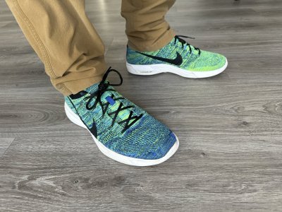
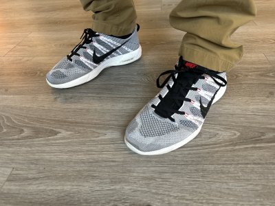
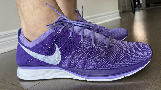
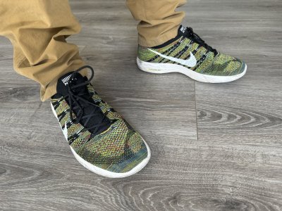
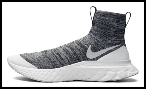
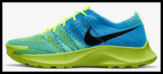
OFFICIAL: Nike Zoom FLYKNIT Collection - Racers + Trainers ONLY - (SIZE POLL ON FIRST PAGE. CHECK TH
- 65
- 14
- Joined
- Apr 3, 2013
please keep them coming.
I love the flyknit script more specifically the last picture. Except in addition to that we could add the name for the group assuming it will be collective and we could make collective in the same font(I could free hand it and then scan to photoshop to clean it up if absolutely necessary) if some one can do it graphically on a comp and add it under "Flyknit" I'm a slightly smaller font.
Also another random idea would be to have each member of the fam send a pic of their current collection and add them add them in a small mosaic style behind the script. Not really looking for any money here but thought it would be pretty unique if executed correctly. Open for more suggestions of course but that is what I had in mind. Could be potentially tacky with the collection pics as the back round but if we could add a consistent font w. the users name on their pic that could be pretty dope too. This may be overthinkg a bit but insomnia always gets the best of me.
Thanks fellas
- 3,610
- 1,163
- Joined
- May 22, 2005
I love the flyknit script more specifically the last picture. Except in addition to that we could add the name for the group assuming it will be collective and we could make collective in the same font(I could free hand it and then scan to photoshop to clean it up if absolutely necessary) if some one can do it graphically on a comp and add it under "Flyknit" I'm a slightly smaller font.
Also another random idea would be to have each member of the fam send a pic of their current collection and add them add them in a small mosaic style behind the script. Not really looking for any money here but thought it would be pretty unique if executed correctly. Open for more suggestions of course but that is what I had in mind. Could be potentially tacky with the collection pics as the back round but if we could add a consistent font w. the users name on their pic that could be pretty dope too. This may be overthinkg a bit but insomnia always gets the best of me.
Thanks fellas
I think instead of collection pics if we did every pair of flyknits known(lunar/chukka/racer/trainer/free) as kind of a collection of the shoes that brought us all together as the flyknit collective. Somewhere in there would be every pair(s) that made us part of the team.
I like it
- 603
- 95
- Joined
- May 26, 2005
Re-Up on the White trainers FSR
http://store.nike.com/us/en_us/?l=shop,pdp,ctr-inline/cid-1/pid-582110/pgid-582109
http://store.nike.com/us/en_us/?l=shop,pdp,ctr-inline/cid-1/pid-582110/pgid-582109
davis
formerly koopa2410
- 5,408
- 145
- Joined
- Nov 1, 2007
Re-Up on the White trainers FSR
http://store.nike.com/us/en_us/?l=shop,pdp,ctr-inline/cid-1/pid-582110/pgid-582109
hallelujah.
- 2,156
- 457
- Joined
- May 5, 2011
Thanks!Re-Up on the White trainers FSR
http://store.nike.com/us/en_us/?l=shop,pdp,ctr-inline/cid-1/pid-582110/pgid-582109
- 5,644
- 922
- Joined
- Jun 1, 2005

- 469
- 138
- Joined
- Jan 25, 2013
Great job, but still looking a bit plain with the font. Maybe adding the blue glow and university red stripe color across the middle of the word, like flagstripes, where the F starts to connect to the other letters.
- 65
- 14
- Joined
- Apr 3, 2013
i like this pic a lot for the logo maybe we could change the color of the font to Volt as that is really the color that got a lot of us into these. Also, CMoney I like the idea pics of all the trainers and racers behind the "script" that would look dope. Although I am not a savy graphic designer I will try to see what I can come up with to add "collective" to the picture above, or if anyone has the ability to do this that would be awesome, I will ess around with some free hand doodles today to see I can make it look right. great ideas fellas
- 666
- 320
- Joined
- Dec 4, 2012
This pic is def Dope, and all the flyknits should be around the logo like a circle. Like the pictures people take. If you do the volt colorway, i suggest make the "Fly" in volt and then the "Knit" in black (Might have to change the background) and leave the nike in whitei like this pic a lot for the logo maybe we could change the color of the font to Volt as that is really the color that got a lot of us into these. Also, CMoney I like the idea pics of all the trainers and racers behind the "script" that would look dope. Although I am not a savy graphic designer I will try to see what I can come up with to add "collective" to the picture above, or if anyone has the ability to do this that would be awesome, I will ess around with some free hand doodles today to see I can make it look right. great ideas fellas
- 5,644
- 922
- Joined
- Jun 1, 2005
Okay, I think we should run with the Volt idea
Here are a few variations, I held my Volts up to the screen to get it as close as possible
Here are a few variations, I held my Volts up to the screen to get it as close as possible
Last edited:
- 3,146
- 2,442
- Joined
- Nov 13, 2012
Good job UNKNWN
I like the volt font.
I like the volt font.
- 5,644
- 922
- Joined
- Jun 1, 2005
Good job UNKNWN
I like the volt font.
I do too, it definitely looks the best.
Whoever had recommended a white background.. I don't think that would really work. I'd much rather see a black background so that the volt can really pop
- 86
- 43
- Joined
- Apr 16, 2013
Very nice UNKNWN.
I'm really digging the 3rd pic. It has a nice, subtle "glow" to it like the photos of the HTM Collection 3 photos from page 1.
I'm really digging the 3rd pic. It has a nice, subtle "glow" to it like the photos of the HTM Collection 3 photos from page 1.
- 666
- 320
- Joined
- Dec 4, 2012
that was me who said to change the background but not to white, i knew it wouldn't pop as much. Try making the just the nike sign white. Nice work, keep it upI do too, it definitely looks the best.
Whoever had recommended a white background.. I don't think that would really work. I'd much rather see a black background so that the volt can really pop
Last edited:
- 3,552
- 2,073
- Joined
- Sep 27, 2012
I'm a big fan of the last one. You're really onto something good here.
Last edited:
- 469
- 138
- Joined
- Jan 25, 2013
Also, maybe you can make the F capitalized. Maybe get the font somewhat similar to the Titlest font.
- 5,644
- 922
- Joined
- Jun 1, 2005
that was me who said to change the background but not to white, i knew it wouldn't pop as much. Try making the just the nike sign white. Nice work, keep it upI do too, it definitely looks the best.
Whoever had recommended a white background.. I don't think that would really work. I'd much rather see a black background so that the volt can really pop
Comin up!
edit:
Last edited:
- 3,146
- 2,442
- Joined
- Nov 13, 2012
I don't know if you could do it but a multi colored font (like of the racers below) would look great IMO
Last edited:
lyl
formerly oldsoie
- 971
- 1,069
- Joined
- Jul 6, 2010
Maybe we can change the color of the "N" and "T" in FlykNiT to stand out for NikeTalk?
- 666
- 320
- Joined
- Dec 4, 2012
Yes!! this looks sickComin up!
edit:
- 416
- 123
- Joined
- May 8, 2013
Comin up!
edit:
[/quote]
I vote this one!
edit:
I vote this one!
- 17,236
- 1,943
- Joined
- Feb 3, 2006
Sorry to make a "poll", but I'm highly considering getting orange racers.
Comfort wise, Trainers or Racers? I only do brisk walking in my FK Trainers...Thanks!
Comfort wise, Trainers or Racers? I only do brisk walking in my FK Trainers...Thanks!
- 24,928
- 52,035
- Joined
- Oct 27, 2005
^ for walking you should be fine with either one. Although, the trainers definitely have more cushioning and are a little more comfortable.
- 24,928
- 52,035
- Joined
- Oct 27, 2005
double
Last edited: