- 238
- 10
- Joined
- Jun 19, 2007
god damn i new it was too good to be true......
Follow along with the video below to see how to install our site as a web app on your home screen.

Note: this_feature_currently_requires_accessing_site_using_safari
Originally Posted by TwoSickJays
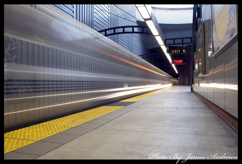
I posted this picture awhile back, but never got any feedback. I would appreciate it a lot. Thanks in advance.


It's not a bad photograph by any means. But if you want "How would Ebayologist have shot this ideally" I think the being low to theground is completely unnecessary I'm sure someone would disagree but it feels like you're almost trying too hard to explore perspective. I and I thinkmost of us can appreciate the attempt for what it is. But it's unnecessary to sort of push the perspective of essential a photograph of an object (a train)that implicitly builds perspective quite well. Like I think J20 said I would ditch the wall on the right and take a few steps closer toward the train (towardthe right) and maybe waist height or slightly above. Also there is some kind of exposure issue that I haven't completely solved as how you could resolvethat. But I think you wanted explore the perspective of the train and instead it feels like its perspective study of the station. And just noticed your focuscould and probably should be signifcantly sharper, I don't know what kind of camera you used, but if any kind of dslr your focus could have beensignifcantly sharper. Also black borders are ridiculous, get a white one or none at all.Originally Posted by TwoSickJays
I posted this picture awhile back, but never got any feedback. I would appreciate it a lot. Thanks in advance.


