- 389
- 374
- Joined
- Mar 30, 2014
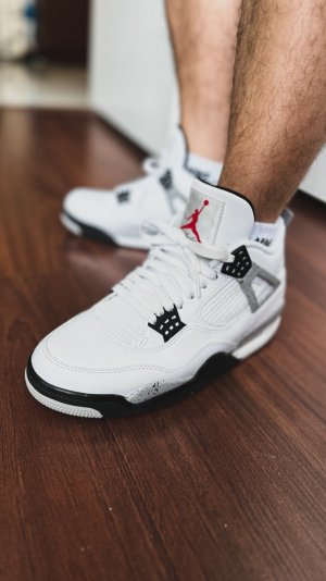
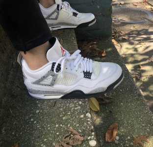
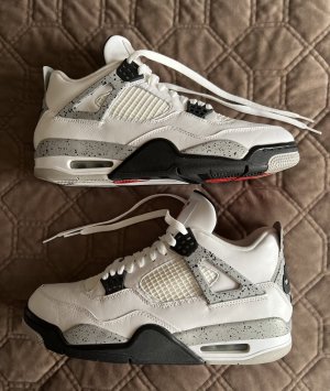
View media item 1681346Not my picture
Follow along with the video below to see how to install our site as a web app on your home screen.

Note: this_feature_currently_requires_accessing_site_using_safari
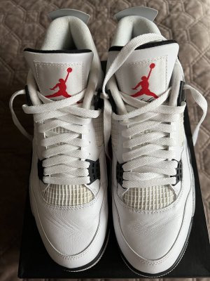
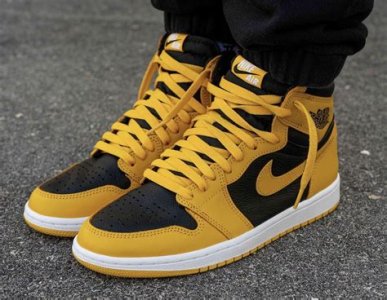
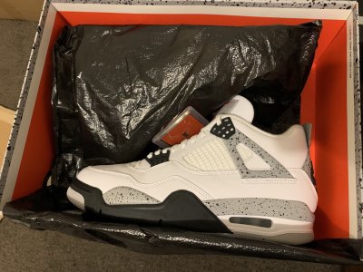
Im hoping those are the 2016 model , if thats the case YES!those look like 99s
Color looks greatView media item 1681346Not my picture
 at y'all really expecting JB to fix all this stuff.
Only thing you should expect is the nike air.
View media item 1681346Not my picture
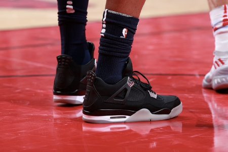
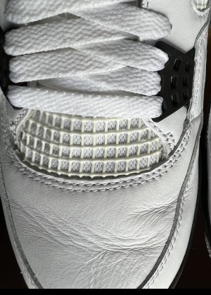
The pen was probably done by someone at nike or the factory to prevent people from taking pictures.whats with the blue pen all over?
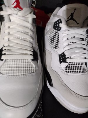
Also, its hard to see, but it looks like the netting is at the correct angle
Would be hard to believe that this isn't just a picture of 99's, but if wrong then there's maybe some hope for decent improvements. Shape is still most important improvement, and no evidence of that yet

View media item 1681346Not my picture
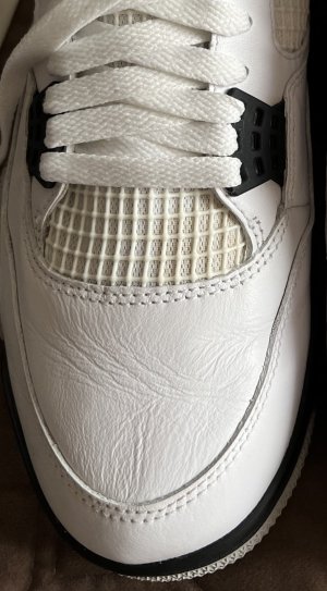
Damn I haven't seen any remaster iv in person but wtf did they remaster if they kept that banana shape?
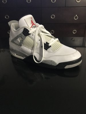
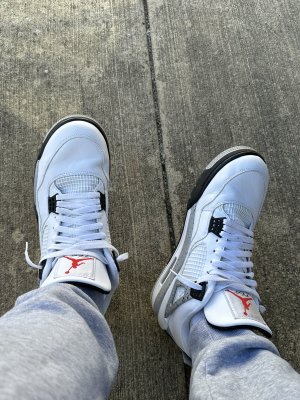
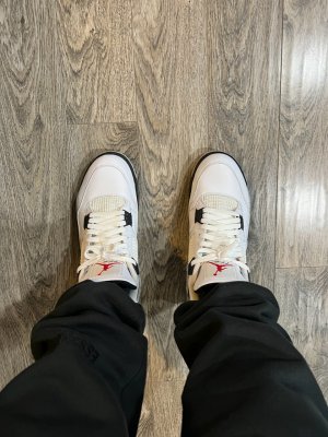
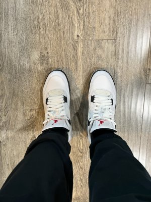
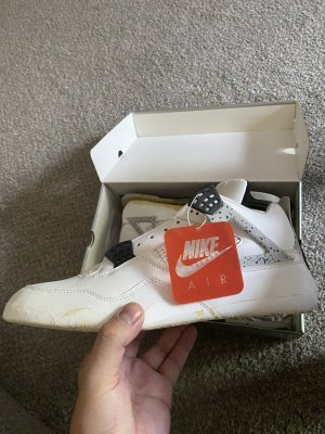
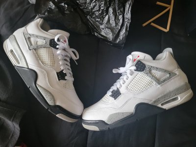
My 99s same angle. Definitely a different shoe. View media item 1686007View media item 1681346Not my picture
My 99s same angle. Definitely a different shoe. View media item 1686007View media item 1681346Not my picture

JB is still using that LA Gear Netting. Way to go JB, matcing LA Gear
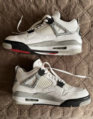
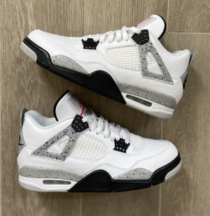
View media item 1686639
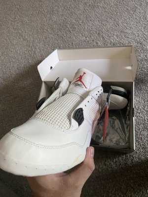
They are gonna look like Shaqs soon
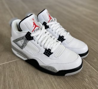
View media item 1686652
The fakes can get the netting right, why cant JB? Even though its not slanted, the thickness is there like it should be.
View media item 1686651