- 1,211
- 813
- Joined
- Oct 14, 2015
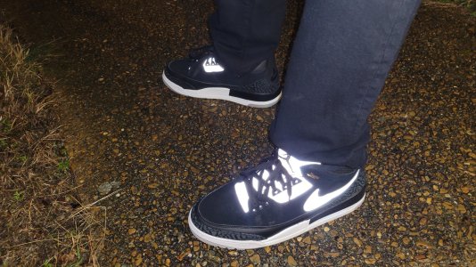
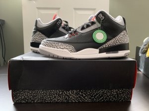
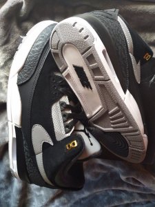
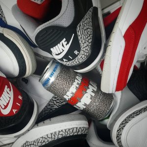
Lmao these joints trash
Follow along with the video below to see how to install our site as a web app on your home screen.

Note: this_feature_currently_requires_accessing_site_using_safari

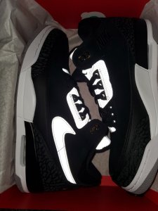
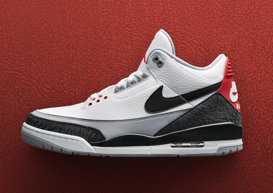
Yeah I think everyone would agree with that.He made the right choice

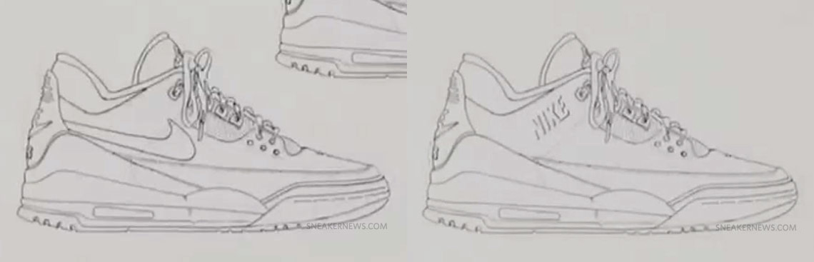

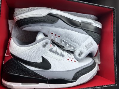
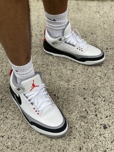
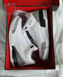
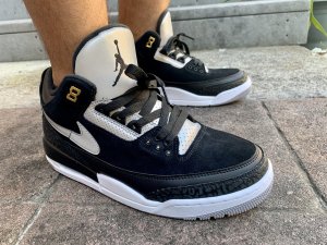
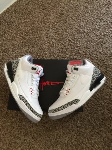
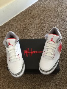
It mightve looked better if they actually followed through on his sketch and stitched just the shadow of the font like how he drew it. They basically just straight up stitched NIKE on there and that's not what is on the sketch.I like these. I wish the stitched gray "nike" wasnt there though. Makes them a little too busy.

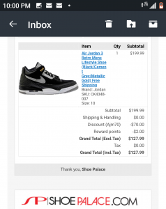
Close though.