- 67
- 10
- Joined
- Jan 6, 2003
What is it?
Follow along with the video below to see how to install our site as a web app on your home screen.

Note: this_feature_currently_requires_accessing_site_using_safari
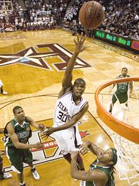
Jacksonbille Jaguars
WOW just wow. I can't even knock having like twelve teams in the sig, cuz iv done it too. But that right there is ridiculous

Originally Posted by JPZx
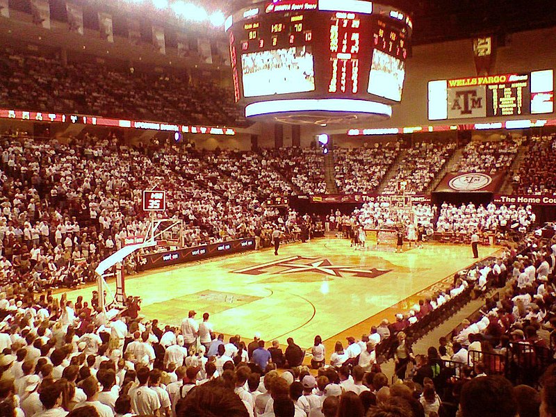
^ Not a homer pick really...watching Texas-Texas A&M game a little bit ago and I wasat the court


I'm sayin...Originally Posted by rsdplaya
that A&M court is niceeeeeeeeee

What are you talking about? Whose color is tan?Originally Posted by swendro88
The Texas A&M court is a joke.
Whose idea was it to use your in-state rivals team color?
Let's paint Crisler's floor green and white and slap a huge maize M in the middle.

FLOORED
Now on to this week's pressing issue: Is it just The Minutes, or has an epidemic of horrific court designs swept America? Everywhere you look, normally inoffensive 94-foot-by-50-foot rectangles of hardwood has been overtaken by cheesy, gargantuan logos, profligate paint jobs and/or excessive signage?
Sufficiently alarmed, The Minutes stepped in with the help of colleague Andy Glockner to identify the best and worst college basketball floors in America.
The offenders, grouped by category:
Animal Gigantism
Boise State Bronco (4). Ostensibly forbidding blue-and-orange horse heads consume the entire area inside both 3-point arcs of Taco Bell Arena (ugh). And you thought the blue turf was bad.
Kansas Jayhawk (5). Why a school with that much tradition would devote so much floor space to a lame cartoon bird is a mystery to The Minutes.
SMU Pony (6). Nearly goes from 3-point line to 3-point line, nose to tail. Add in the fact that the two-point area is all painted red and you have an aesthetic disaster.
Fresno State (7) and James Madison (canines. Bad dogs. Madison's wears a crown, Fresno's a spiked collar. Both would look better playing poker.
Ramkind (9): Colorado State Ram, Rhode Island Ram, Fordham Ram, VCU Ram. We're overrun with ram-related crimes against aesthetics. Clearly, our nation is in desperate need of a graphic artist who can come up with a decent male sheep logo.
Letters/Symbols Visible from Space
Clemson Tiger paw (10), Rutgers "R" (11), Western Illinois initials (12) and Alabama "A" (13). Apparently designed by the same people who form crop circles for aliens to see when landing in our midst.
Liberty lettering (14). Give the Falwellian Flames credit for being original and avoiding center-jump trash. But the words that blare above and below the circle overpower the court. Editor's note: We have been informed that Liberty replaced that floor for this season.
Parquet Faux Pas
Western Illinois, Texas A&M and Massachusetts (15). Just because it worked for the Celtics doesn't mean it will work for you. In fact, most schools with parquet floors are notably lacking in significant hoops tradition.
Clutter
Southern Illinois (16). In the picture The Minutes saw, there were nine logos on the floor. Looked like an outfield wall in the Carolina League. Then again: If you've got nine, might as well go for double digits. Surely there's a Carbondale muffler shop willing to grab some of the remaining floor space.
Statewide Ugliness
Idaho (17). From Boise to Moscow (Idaho has a towering "I" and a huge script "Vandals") to Pocatello (a not-terrible tiger and block "Idaho State"), this is the land that taste forgot. Runner-up is Kansas, where the Jayhawks and Kansas State Wildcats -- who should know better -- are saved only by the relative restraint of Wichita State.
Wade Barker/Icon SMIBetween the gigantic logo and the parquet, A&M gets Forde Minutes' vote for ugliest court.
Unacceptable State Outline
Texas A&M (1. The Aggies just had to have a bigger state-of-Texas outline than the Longhorns, so theirs stretches very nearly from key to shining key. Combine that with parquet and a too-large logo on top of the state outline and you have The Minutes' vote for the ugliest floor in America.
Now the winners:
Acceptable State Outline
Indiana (19). Tastefully sized and fundamentally unaltered for years.
Staying Centered
Stanford (20), UCLA (21), Michigan State (22). All of them contain their midcourt logo to midcourt, and keep it simple. Stanford uses its university logo: the "S" and the tree. UCLA's says, of all things, "UCLA." Michigan State goes with a block "S," but takes a small demerit for turning the free-throw circles into basketballs.
Hottie Exemption
Kentucky (23) has a logo larger than its lordly station should countenance. However, occasional center-court appearances of Ashley Judd (24) to wave to the fans have a positive diminishing effect on the overgrown "UK."
Animal On A Leash
Butler (25). They keep the (non-cartoonish) Bulldog logo contained to the center jump circle in hallowed Hinkle Fieldhouse. And the rims are 10 feet high. Just ask Norman Dale.
Animal Gigantism Exceptions
Montana and Arkansas (26). The Grizzlies get a pass because their Grizzly bear looks semi-authentic, and because he's indigenous. The Razorbacks get a pass on their monster pig because their fans can appreciate the silliness. They wear plastic pig hats, after all.
The Anti-Trend
Arkansas-Little Rock (27) has absolutely nothing but a circle at center court. No words, no logos, no identifier at all. Makes for quite a contrast with the prodigious porcine in Fayetteville.