- 1,237
- 668
- Joined
- Nov 8, 2014
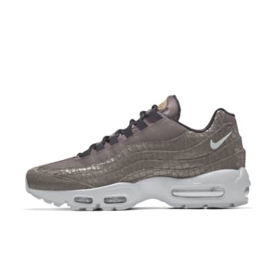
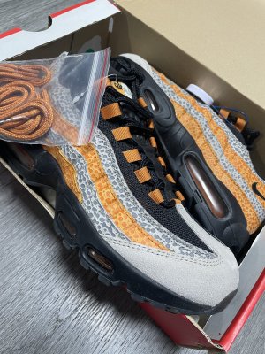
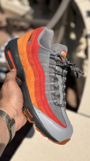
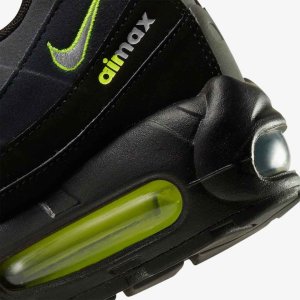
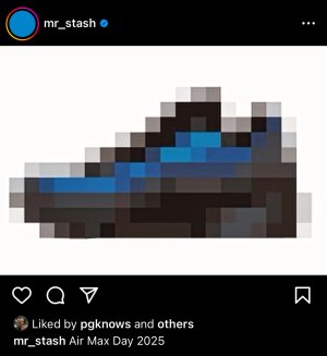
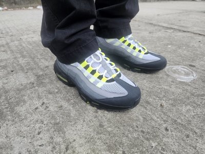
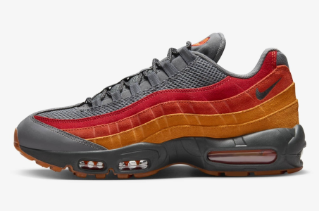
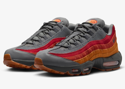
Yea. Don't get me wrong. It's not a deal breaker, but they would have been perfect if the black made it to the r IMO. I'm still satisfied otherwise and glad they didn't outline the swoosh like the Crystals. Now I need the Mandarins.yeah this is another spit in the face from nike. Makes no sense.
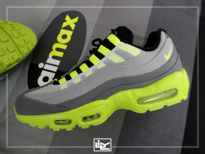
Splitting the colors at the “r/m” was the WHOLE idea for that logo, merging the two words air max in a genius and creative way.
this has to be intentional too. Dudes just getting their rocks off in the nike offices.