- 32,832
- 24,892
- Joined
- Sep 23, 2012
I like the new layout better. Looks futuristic. We’ve made it boys
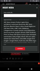
Follow along with the video below to see how to install our site as a web app on your home screen.

Note: this_feature_currently_requires_accessing_site_using_safari
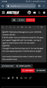
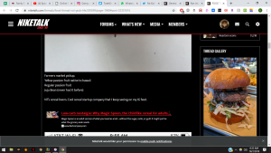
This has been fixed. You can also tap the image itself in full view and see the gallery that way.Just tried it in this thread and got the same message as below.

Unicode emoji support - it's like living in the not too distant past. I can't believe the platform didn't have it when we moved here two years ago, but better late than never.Great updates especially using actual emojis
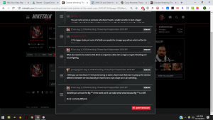
Yeah, the system's churning through decades worth of images right now to process all of the new thread image galleries. Once that's complete, the site should start running more smoothly. I appreciate everyone's patience!Site is running slow for me. I'm on mobile. Also clicked post reply a few times and it didn't work.
We actually had to change the layout for a couple of reasons:I didn't see any reason to change the old layout but change is inevitable.
I use desktop on mobile and I feel like the size of everything was much better before.
Everything fit better.
I'll probably get used to this just like the previous changes.
But I really liked the last version.
Last version was Jordan 1
This is like Jordan 3
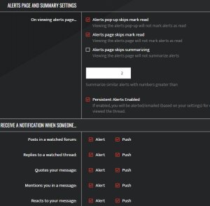
This was addressed on the previous page, but the short answer for this right now is: switch to the OG theme. That's a bit faster for low powered devices, but we're going to work on reducing some of the system demands of the new theme for devices with integrated graphics.Always appreciate the changes those behind the scenes make towards improving the site. One thing...im on mobile, but scrolling seems choppy.
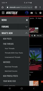
Right here: https://niketalk.com/watched/threadsNew features are cool. I don't mind the layout.
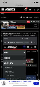
Where can I find my watched threads?

 but the grey is growing on me might switch back and let it rock for a minute.

The new site loads very slow, and we lost our dark mode..the site now looks grey on my phone.
If they bring back gif avys, site will even take more time to load.Takes forevee to load pages and posts to submit
Can we bring back the gif avys
If they bring back gif avys, site will even take more time to load.