- 664
- 822
- Joined
- Sep 11, 2012
I like the new layout. Seems to have mobile in mind first.
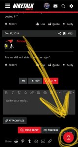
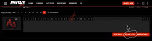
My only feedback would be the report button. That is way too prevalent, almost makes me want to report every post. lol I personally thin it should be shifted to the right while all the other icons shift to the left. (or keep it all to the right and have the report icon to be the furthest right)
Other than that, site looks dope.
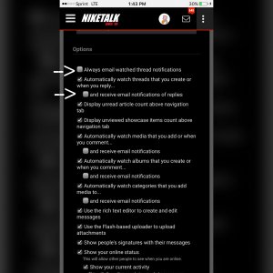
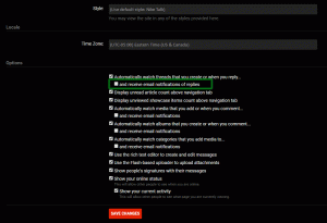
We're so glad you noticed! We designed every aspect to be completely mobile tailored. Nowadays, everyone is on the go and seldom do you bust out your laptop to go on a website. Many of our friends here on NT have awesome phones that can access the site just fine. We wanted to make sure NT can go with you wherever you may be!
The Report button is visible and obvious so that we can quickly address any problematic posts. Although it maybe prevalent, it serves a purpose. We hope you give it a try and if you still feel the same way later, let us know. We're always open to improving the experience for everyone's comfort.
Thank you again and enjoy the new NT!