- 7,315
- 28,681
- Joined
- Dec 8, 1999
As many of you know, we've now organized a number of group fundraising projects to support disaster relief efforts around the world. Most recently, we raised over $10,000 together to help Mercy Corps deliver aid and support in the wake of Super Typhoon Haiyan: http://niketalk.com/t/574444/please...ilippines-in-the-wake-of-super-typhoon-haiyan
As part of that fundraiser, we acknowledged all contributors using special badges, like the ones you can see in my signature, and in the signatures of many other NikeTalk members. These badges were all designed by our fellow members in the days leading up to the launch of our fundraising project.
I'm hoping we can count on you once again to assist us with our latest group fundraiser, this time in support of our friends at Room to Read.
You may be wondering, "why Room to Read and why now?"
As it happens, there's a special crowdfunding campaign going on right now at CrowdRise called the Skoll Social Entrepreneurs Challenge, and it offers some tremendous benefits that were unavailable to us in any prior group fundraiser.
First and foremost, EVERY contribution is matched by the Skoll foundation, instantly doubling their effectiveness. What's more, they're also covering the transaction fees. Normally, transaction costs can be in excess of 3%, depending on how they're handled. That adds up in a hurry.
In this case, if you contribute $20, not only is literally every penny of that going straight to Room to Read, but the amount actually gets doubled, so it would have the effect of giving $50.
There are weekly bonus challenges, too, that can net the organization even more money. I know that there are many worthy causes out there right now, but the matching potential here makes this an opportunity that we can't ignore. In December, we'll hold a special vote to determine the recipient of a special 15 year anniversary donation, so there will be an additional opportunity then to support other causes. At the moment, we're eager to take advantage of the limited-time matching potential afforded by this event.
All told, the matching funds and the mitigation of all transaction costs would allow this to be our most efficient group fundraiser ever - and, having contributed to Room to Read since 2009, we know just how much they can accomplish with the money we raise.
For as little as $5,000, a library can be established in Asia. In some countries, a full year's scholarship for a young student costs as little as $250. If we can manage to raise $2,500 together - a very reasonable goal given our past performance - with the match that would be sufficient to allow Room to Read to develop a library that might not otherwise exist.
For my money, Room to Read is the best nonprofit in the world dedicated to promoting literacy and gender equality. Regular members may recall that NikeTalk sponsored the construction of a library in Nepal, a pre-school in Sri Lanka, and, coming soon, the publication of an original children's book in South Africa, in addition to providing support for their Girls Education program.
Unfortunately, they haven't had much help with this particular crowdfunding effort to date, but I think that, together, we can give them a hand and make a real difference.
If you're interested in joining with us for this, here's how you can help:
1) Help us design our reward badges!
We need three different badge designs: one for those who contribute between $10-24, one for those who contribute between $25-99, and one for those who contribute over $100.
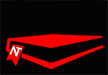
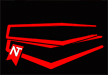
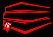
These were the winning designs for our last group fundraiser:
$10 - 24 Basic Supporter Badge
$25 - 99 Special Contributor Badge
$100+ Elite Fundraiser Badge
(The designs were created by @Fongstarr, @Nawzlew, and @spicedham
I'm hoping that we can create some great looking designs together that will inspire our fellow members to contribute.
To qualify, ALL of the designs have to fit into the same sized box as you see in these previous examples. We're looking to differentiate each level be DESIGN, not size, so it's important to illustrate the progression as well.
With military ranks, for example, progress can be conveyed through increased complexity or the addition of iterative elements that build upon one another.
This is the Room to Read logo:
Some obvious ideas there might be to use the colors with our NKETLK script, employing the roof overhead, etc.
If you don't want to use the logo in your submission, try to incorporate books or literacy within your theming. We want to make it clear at a glance which projects our members have supported.
For maximum efficiency, all rewards must be digital - so great badge design will make all the difference.
2) Help us get the word out when we launch!
Once we have all the badges in place, our campaign can begin in earnest here next week: https://www.crowdrise.com/roomtoread2014-se/fundraiser/niketalkcommunity
We'll launch an official thread and feature it on the front page, but it'll be up to all of us to rally as much support as possible to make the most of this opportunity.
Anyone who wants a badge at that time will simply need to mention their NikeTalk username within the comments box upon submitting their contribution.
Let's see what the "NikeTalk effect" can do to give Room to Read a boost in this challenge.
As always, I greatly appreciate your support and welcome your suggestions as we work together to make this fundraiser the best it can be.
As part of that fundraiser, we acknowledged all contributors using special badges, like the ones you can see in my signature, and in the signatures of many other NikeTalk members. These badges were all designed by our fellow members in the days leading up to the launch of our fundraising project.
I'm hoping we can count on you once again to assist us with our latest group fundraiser, this time in support of our friends at Room to Read.
You may be wondering, "why Room to Read and why now?"
As it happens, there's a special crowdfunding campaign going on right now at CrowdRise called the Skoll Social Entrepreneurs Challenge, and it offers some tremendous benefits that were unavailable to us in any prior group fundraiser.
First and foremost, EVERY contribution is matched by the Skoll foundation, instantly doubling their effectiveness. What's more, they're also covering the transaction fees. Normally, transaction costs can be in excess of 3%, depending on how they're handled. That adds up in a hurry.
In this case, if you contribute $20, not only is literally every penny of that going straight to Room to Read, but the amount actually gets doubled, so it would have the effect of giving $50.
There are weekly bonus challenges, too, that can net the organization even more money. I know that there are many worthy causes out there right now, but the matching potential here makes this an opportunity that we can't ignore. In December, we'll hold a special vote to determine the recipient of a special 15 year anniversary donation, so there will be an additional opportunity then to support other causes. At the moment, we're eager to take advantage of the limited-time matching potential afforded by this event.
All told, the matching funds and the mitigation of all transaction costs would allow this to be our most efficient group fundraiser ever - and, having contributed to Room to Read since 2009, we know just how much they can accomplish with the money we raise.
For as little as $5,000, a library can be established in Asia. In some countries, a full year's scholarship for a young student costs as little as $250. If we can manage to raise $2,500 together - a very reasonable goal given our past performance - with the match that would be sufficient to allow Room to Read to develop a library that might not otherwise exist.
For my money, Room to Read is the best nonprofit in the world dedicated to promoting literacy and gender equality. Regular members may recall that NikeTalk sponsored the construction of a library in Nepal, a pre-school in Sri Lanka, and, coming soon, the publication of an original children's book in South Africa, in addition to providing support for their Girls Education program.
Unfortunately, they haven't had much help with this particular crowdfunding effort to date, but I think that, together, we can give them a hand and make a real difference.
If you're interested in joining with us for this, here's how you can help:
1) Help us design our reward badges!
We need three different badge designs: one for those who contribute between $10-24, one for those who contribute between $25-99, and one for those who contribute over $100.
These were the winning designs for our last group fundraiser:
$10 - 24 Basic Supporter Badge
$25 - 99 Special Contributor Badge
$100+ Elite Fundraiser Badge
(The designs were created by @Fongstarr, @Nawzlew, and @spicedham
I'm hoping that we can create some great looking designs together that will inspire our fellow members to contribute.
To qualify, ALL of the designs have to fit into the same sized box as you see in these previous examples. We're looking to differentiate each level be DESIGN, not size, so it's important to illustrate the progression as well.
With military ranks, for example, progress can be conveyed through increased complexity or the addition of iterative elements that build upon one another.
This is the Room to Read logo:
Some obvious ideas there might be to use the colors with our NKETLK script, employing the roof overhead, etc.
If you don't want to use the logo in your submission, try to incorporate books or literacy within your theming. We want to make it clear at a glance which projects our members have supported.
For maximum efficiency, all rewards must be digital - so great badge design will make all the difference.
2) Help us get the word out when we launch!
Once we have all the badges in place, our campaign can begin in earnest here next week: https://www.crowdrise.com/roomtoread2014-se/fundraiser/niketalkcommunity
We'll launch an official thread and feature it on the front page, but it'll be up to all of us to rally as much support as possible to make the most of this opportunity.
Anyone who wants a badge at that time will simply need to mention their NikeTalk username within the comments box upon submitting their contribution.
Let's see what the "NikeTalk effect" can do to give Room to Read a boost in this challenge.
As always, I greatly appreciate your support and welcome your suggestions as we work together to make this fundraiser the best it can be.