- 10,438
- 22,644
- Joined
- Oct 6, 2016
Impressive. I will try this.A Magician never reveals his secrets.
Lemon ups may have gotten you multiples, but have you ever presented them Lemonades instead?
They offered me multiples with an employee discount.
Follow along with the video below to see how to install our site as a web app on your home screen.

Note: this_feature_currently_requires_accessing_site_using_safari
Impressive. I will try this.A Magician never reveals his secrets.
Lemon ups may have gotten you multiples, but have you ever presented them Lemonades instead?
They offered me multiples with an employee discount.
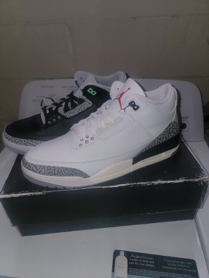
I got two pairs, one retail one resale.
These weren't easy where I'm from, a city with nearly 1 million people and 2 million-plus in the metro area.
No matter what you say, I would bet that the majority of people in this thread would not say that these were "very obtainable". (As vague as that sounds)


Meanwhile I did ONE raffle entry for my local Hibbets and won. I struck out on SNKRS... Talking about the chances... Just the luck of the draw...This. I entered at least a dozen raffles. Entered at FTL and Champs with 3 stores chosen and full head starts. Tried my Richard's for a wristband. Had multiple people try for me on snkrs, and only hit 1 pair which was my own snkrs account. These were not easy by any stretch of the imagination.
Even the shades of grey look different. Wild.
On purpose? No. Their EP sheets are all over the place. Nike should be looking into why they were SO inconsistent in look.According to some of the dudes in here Nike did it on purpose cuz we have to reimagine that they’re the same color and pattern.
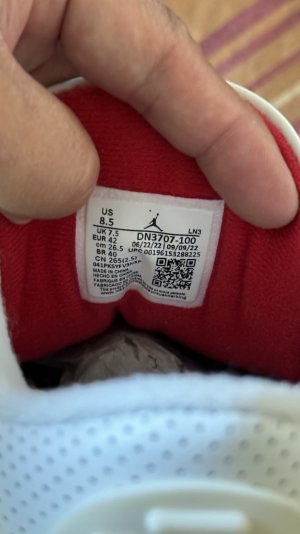
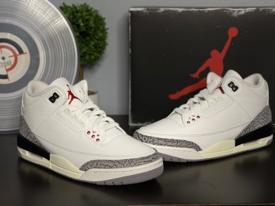
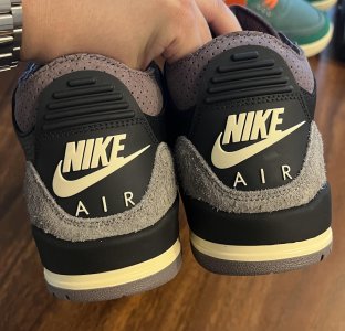
PeoplensleepI picked up both my $275 10.5’s. The print matched on each pair, and they’re lacking any major defects so I can’t complain for striking out 0/30 something. Interestingly enough, I correctly identified the factory on each pair from seeing pics here. The really nice thin print, slightly lower on the toe box pair was LN4 and the thicker (but not sharpie thick) and higher toe box EP was LN3.
I’ll post up some pics tomorrow but I’d be happy with the LN3 if I didn’t have the LN4. In comparison it doesn’t look quite as clean though. I can understand the disappointment if you got really chunky EP just because it looks less OG and more like typical retro quality with the improved shape. The LN4 pair gives me a surprisingly different feel. More noticeable than the pics.
A lot of talk about the improvement of very little ankle padding, but I think they could have provided a little more without puffing up the upper. I wore my green 2’s today and they’re so comfortable with a lot of padding. Putting my foot in this shoe felt like it has no padding at all and might not be very comfy.
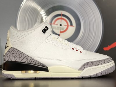
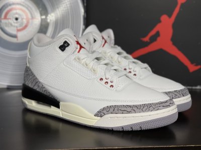
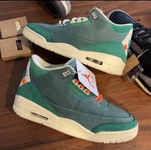
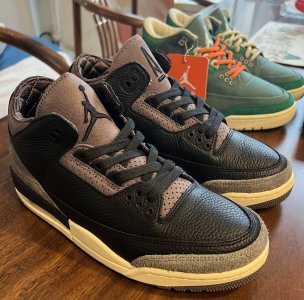
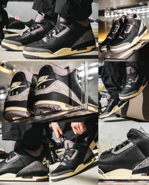
I like the Sail/yellowed midsole and tab. I’m going to do some fits with an off white tee, charcoal beanie, white hoodie. Nitpicking aside, this is one of my favorite retros in quite awhile. The FR3 is really well executed as was the Cardinal 7, and to a lesser extent the Chicago 2’s. I skipped the L&F but I’d put these near the top of GR’s since 2016.
I mean, not intentionally making them match is not technically the same things as purposely making them not match“They purposely made the shoes not match”
The **** I read in some of these threads.Ride that swoosh like a soldier


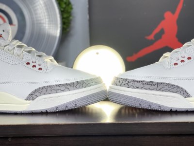
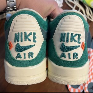
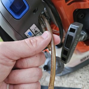
But that's not how nike science worksTo me I see three different prints.
The super fine print that is NOT consistent to the original.
The medium print that is.
The fat Sharpie print that everyone seems to dislike. But still looks pretty decent in grey, not black.
Regardless of what style you get, they should at least match up through the pair. The fact that several dont is the biggest problem here. imo. If the same problems happened in 1988, who cares. In 2023 my pair should be more advanced QC wise.
Your crib came with the built in tuck. You should be coolMy SNKRS draw pair sitting at my front door along with eBay Nike Dunk that arrived a few days ago… totally forgot to deviate delivery through FedEx app… hope they still there until we get back on Sunday

I just tripled up. All pairs via ebay so I could see what I was getting. Sold my fat-print Footlocker pair. More expensive but on this one I just don’t care. Favorite shoe ever along with Concords.I kinda want to double up but it’s taking a huge chance with all the QC issues and inconsistencies. I have enough GOAT credit to cover a pair but still. My FTL pair is pretty decent.
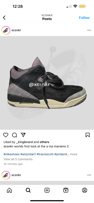
Are those LMN?UNDS Today life too short to keep this grail on ice
Gammas > Cherry highs.
These are going to be in the low 300's. They won't sit like FR3's. Won't be busting folks to the white meat like LF's. Somewhere in the middle.
 but we were wrong? quit cherry picking