- 654
- 435
- Joined
- Feb 8, 2001
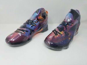
The all-star logos on the back appear to be Velcro patches. There's some nice detail, but probably not enough to save the shoe for me. That green just isn't working.....
Follow along with the video below to see how to install our site as a web app on your home screen.

Note: this_feature_currently_requires_accessing_site_using_safari


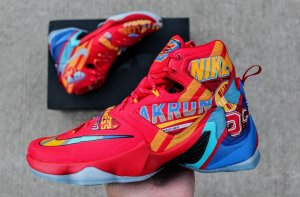
Well, the box is cool at least...
Well the box looks dopeActually. These are not bad at all. cant wait for more pics
No one will iD these. The 13 iD's are already dead
What if Nike is making these bad on purpose so that they force you to buy the All Star ID options? Genius.
I don't mind the olive colorway, just don't understand it's place on this shoe for this ASG game, given the location, colors, theme.
I feel like if you know the city they are playing in, have seen the uniforms, and seen the shoes, and can't figure out the "inspiration" for the colorways without reading their story, they either failed or are trying to hard.I'm interested in finding out the inspiration.......though it obviously seems to be a military theme of some sort. Maybe it's supposed to resemble a classic Canadian Air Force jet, or a paratrooper type of thing, with that weird tongue made to look like a parachute or something. I'm know I'm probably way off, just thinking out loud here....
Whatever the case, it's a more interesting inspiration than last year. The AS XII are nice, but that supposed Flatiron inspiration was so weak.