12/19/21 Site Update

Methodical Management

Staff member
Co-Founder
7,321
28,697
Joined
Dec 8, 1999
Early this morning, a new site update was installed on NikeTalk.

As NikeTalk does not have a billion users, it is not feasible for us to custom develop a social media platform entirely in house. We thus rely on third-party forum forum software and are obligated to install any and all updates containing critical security fixes for the safety of all our fellow community members and viewers.

Unfortunately, there are a few rough edges with this latest update for us to polish.

Please report any you find here, so that we may review and address them In order of priority.


We already aware of and working on the following:
  • New posts indicator in forum view is currently missing and will be restored shortly.
  • The post editor on mobile is missing options.
  • Some users are encountering issues with the alerts pop up, depending on their settings. As a first step, check your alerts settings here: https://niketalk.com/account/preferences#alerts

    If you want all the alerts to clear the moment you tap on the alerts, note the “alerts pop-up skips mark read” setting and ensure that it is unchecked.
Please note that the “blank space” in the advertisement locations is not a glitch and serves to address a phenomenon known as “layout shift.” In the past, you may have noticed that pages seemed to jump around or shift as you scrolled. This occurs because different elements load in to pages at different times, and it's most pronounced on slower connections. (e.g. mobile.)

Ads are the LAST element to load in. Since ads come in a variety of sizes, the only way to prevent them from causing the layout to shift is to reserve the maximum possible amount of space that each one could occupy in advance, so the page doesn’t shift once they’re loaded.

We did not increase the number of ads as part of this update.

If you’d like to remove the ads while still supporting the site, we offer an account upgrade option here: https://niketalk.com/account/upgrades

All account upgrade fees, less only the amounts deducted by payment processors (PayPal, credit card companies, etc.) are donated to charity at the end of each year.
 
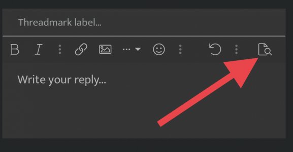
The preview a post option that use to be right next to 'post reply' is completely gone for me on mobile.
 
The preview a post option that use to be right next to 'post reply' is completely gone for me on mobile.
DC2874A9-ADF9-47B2-8BB2-589280E45F38.jpeg
 
Seems fine, things have a snappier feel to them. Few thoughts:

-The alerts number still doesn't clear with the feature unchecked. Toggled on and off and still the same.

-Share options are uncomfortably close to the reply button, is there an option to view no share options?

-Main forum return link too far down in the page, can that be moved above the Similar threads option? Can Similar threads be disabled?
 
Preview reply? I sometimes type [/b] if it’s quick :lol:
 
How many things can be addressed? And what can't be?

The notification button doesn't clear when you open it. Has to click on each individual bit to clear each.

There's not button on the individual pages anymore to go back to the unbrella thread. Like if youre in the TAN, then there used to be a button to take you to the Lounge to then quickley go to the Sports. So more steps are needed for that. Not a deal breaker, but it did just streamline things.

Of course you've already heard about the 'Similar Thread' area. It's overloaded.

For some reason when I try to upload photo's from my phone camera folder, it just freezes and doesn't open. It did the same before the update too, I meant to mention. Not sure why. It scans them from my other folders on my phone like screenshots and ig, but my actual camera folder, nope. Any thoughts? Maybe too many photos to read?

I'm not sure what extent you guys can adjust or alter things, But I'm down to offer ideas or suggestions if you guys want them. Of course we don't want to change every little thing just for the sake of it.
 
Seems fine, things have a snappier feel to them. Few thoughts:

-The alerts number still doesn't clear with the feature unchecked. Toggled on and off and still the same.

-Share options are uncomfortably close to the reply button, is there an option to view no share options?

-Main forum return link too far down in the page, can that be moved above the Similar threads option? Can Similar threads be disabled?
Our developer is investigating the alerts issues.

In the meantime, you could try disabling “persistent alerts” as well to see if that works. They may have changed some of the system defaults, because I get the sense that most people want the alerts to work the way they do on other platforms, where an alert isn’t cleared unless directly acted upon, so if you get 10 different alerts they aren’t all cleared instantly. There’s a “mark read” link in the pop-up, too.

The distance between the share button and the reply button hasn’t changed at all. I checked an old screen shot to be sure. This wasn’t a design update. It was primarily a system/security update to improve performance and security.

There’s a forum directory right in the site header. You don’t need to be scrolling to the bottom of the page for this. Tap the menu button to the left of the NikeTalk logo in the header. Tap the forum you want. You’re there.

On desktop/tablet there’s also a forums drop down list in the header.

How many things can be addressed? And what can't be?

The notification button doesn't clear when you open it. Has to click on each individual bit to clear each.

There's not button on the individual pages anymore to go back to the unbrella thread. Like if youre in the TAN, then there used to be a button to take you to the Lounge to then quickley go to the Sports. So more steps are needed for that. Not a deal breaker, but it did just streamline things.

Of course you've already heard about the 'Similar Thread' area. It's overloaded.

For some reason when I try to upload photo's from my phone camera folder, it just freezes and doesn't open. It did the same before the update too, I meant to mention. Not sure why. It scans them from my other folders on my phone like screenshots and ig, but my actual camera folder, nope. Any thoughts? Maybe too many photos to read?

I'm not sure what extent you guys can adjust or alter things, But I'm down to offer ideas or suggestions if you guys want them. Of course we don't want to change every little thing just for the sake of it.
I upload photos from mobile all the time without issue. This might be a device issue. If anyone else has encountered this, let us know.

I believe I addressed the other issues above.

”Similar threads” has been up for all of one day and it’s at the very bottom of the page. I’m not going to make a knee jerk reaction over comments from people who were acting like the sky was falling because the timestamp text was two shades darker for three hours.

I love that people care deeply about the site, but it’s important to keep things in perspective and remember that there are human beings on the other side of this. We didn’t update the site to make change for the sake of change. We did it for the same reason you’re not running Snow Leopard or Windows Vista. You update your software, you appreciate the benefits, you adapt or cope with any changes with which you’re less than enamored.

Suggestions are always welcome when respectful and constructive, just understand that not everything is actionable. If you have any particular items on your wish list, I can give you an approximate likelihood of its implementation.

I get that people have certain expectations set by other sites/software they use, but at times it’s kind of like asking why the local, independently owned neighborhood restaurant doesn’t have the same prices as Applebee’s or the same “entertainment” as Rainforest Cafe.

We don’t have a billion users. We don’t have a business plan built around harvesting and selling behavioral data from our users. We don’t have the money to custom code and maintain our own social media platform, test it on every device known to humanity, and revise it every time there’s a new product/App Store policy change/Algorithm change.

We license third party forum software and do our best to customize it to suit our community members’ needs. For the same reason it wouldn’t make much business sense to do a $2 million build-out on rental property, there are limits to how much we can responsibly invest in a platform like this when we’ve had to change platforms multiple times over the years to stay online. We’ve already built some custom stuff - like the much requested thread image galleries, but, if we want to stay flexible, we have to run reasonably close to stock - otherwise we’re tied down by investments in a particular platform

I can’t sit here and promise to deliver an experience that’s as frictionless as one produced by a publicly traded multinational corporation when we have approximately 0% of their budget. Honesty is a two way street.

What I can promise is that we appreciate respectful, constructive feedback, and that we’ve been doing our best for the past 22 years to serve the community for whose benefit NikeTalk was created.
 
You keep saying NikeTalk doesn't have a billion users but I'm not sure I believe that
A billion users and only a couple dozen complaints about today’s update? Wow.

Maybe you’re thinking of total page views over 22 years.

You can see the total number of registered members and users online from the front page if you’re curious, though.

Rest assured, Nelson and I aren’t fueling up the starship NT-prize. Sneaker collecting may have grown exponentially over the past two decades, but we’ve tried our best to stay true to our core constituency and avoid clout chasing.
it was a joke man. the update is cool
 
The distance between the share button and the reply button hasn’t changed at all. I checked an old screen shot to be sure. This wasn’t a design update. It was primarily a system/security update to improve performance and security.
Maybe i'm misremembering, but they seem much closer, i've fat fingered a tumblr or email a couple times. Only on mobile, in some threads, not all.

ie this thread https://niketalk.com/threads/so-whats-good-with-subway.692212/

this is what it looks like on mobile for me:
Screenshot_20211220-094820_Chrome.jpg

Ah, I see. I thought you were referring to the reply link at the bottom of each individual post and the share button in the header of the following post, which are closer together than the Tumblr link is to “post reply” on mobile. (In desktop, tablet, post reply is now followed by the “similar threads” list.)

We need share links, but perhaps we can consolidate them a bit on mobile.

Any way to change twitter post back to white? or is dark mode default?

Not that I'm aware of.
 
Adding images via copy/paste is really slow for me. Like one image every 60 seconds. I used to run a board back in the day so I get the upgrading and the site management and hiccups. Hang in there.
 
Back
Top Bottom