- 3,384
- 6,663
- Joined
- Sep 5, 2000
Elephant print is not enough for me. JB needs to stop ****ing around and give us real elephant skin. Make these better than the OGs
Follow along with the video below to see how to install our site as a web app on your home screen.

Note: this_feature_currently_requires_accessing_site_using_safari

How did ya miss the /s at the end? It means sarcasm
I’d be fine with this. I’d welcome any tweak that’ll make them even closer and more consistent with the OG.To which i can see them at least cutting it down a tad bit more, to give them an overall more OG look, like the pictures i just posted.
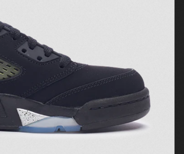
I don’t know how you can mention ankle bubbles and tongues but completely ignore the steel toe buffoonery5: tongue, tongue, tongues. Did I say tongues? Yea. Those need fixin. Ankle bubbles are too big also. Toe isn’t too bad but still not quite where it should be. Definitely plenty of room for improvements.
I don’t know how you can mention ankle bubbles and tongues but completely ignore the steel toe buffoonery

If the elephant print on the reimagined 3,s are too thick, then what have you been seeing on reto 3,s, before they gave us the reimagined 3,s?
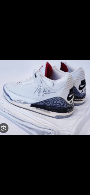
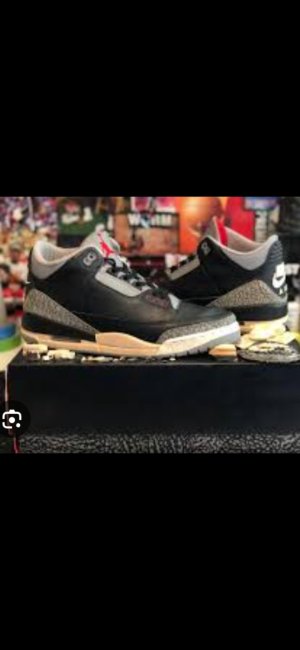
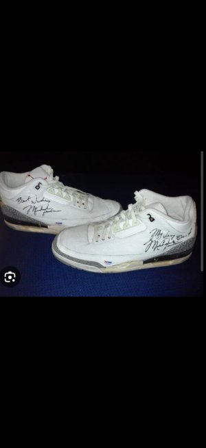
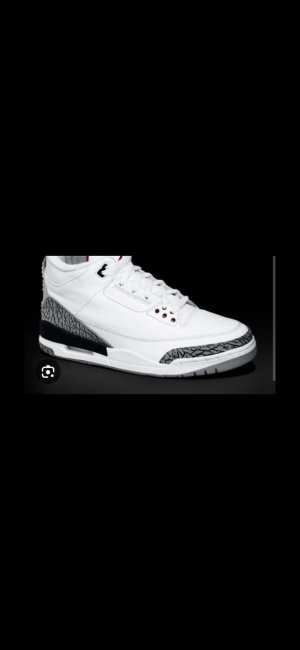
All jokes aside, the 88 OG 3,s had crazy thin elephant print cuts on them. Im guessing since it's been reported that they're changing the shapes on 5,s and 3,s for the upcoming releases. That were going to get something similar to these. I can do thin cuts on the white cements, but im not a fan of the thin cuts on the Black Cements.
Basically these!
Ive been a lurker here since 09. Found this site as a 14 year old trying to find out how to cop the space jam 11's and have visited ever since. I literally re activated my account to rebound on your point about the 11's. Jordan Brand if you are listening, PLEASE FIX THE TOE BOXES ON THE JORDAN 11'S. Every time i see a 2000 retro or a OG pair it liteally makes me angry I dont own a pair. They look so much cleaner. AND FIX THE RED SOLE ON THE BREDS. That maroon dark red sole ruined the 2012's. You have a great eye for the details.My .02 for where each model currently is, 1-14.
1: 85’ cut is good enough for me. It’s not totally a 1:1 of the actual 85’s but close enough.
2: I can’t say I really like these enough to care. But I do have the black/cements, and these seem to be near identical to the OG 2’s in terms of shape, height, profile, etc.
3: 3’s are fine as they are imo. Not much else they can do with them. Maybe make them a little taller? Idk. This model is currently in the best shape of all the old Jordans though.
4: They are FINALLY getting to a point of being acceptable, or even pretty good. All the pics of people getting their MB’s have me more excited for a 4 release than ever before, or at least since 99’.
5: tongue, tongue, tongues. Did I say tongues? Yea. Those need fixin. Ankle bubbles are too big also. Toe isn’t too bad but still not quite where it should be. Definitely plenty of room for improvements.
6: the 6 is in pretty good shape overall. Needs taller tongues, and the toebox could still use a slight improvement.
7: 7’s are in a great place overall if the recent Cardinals are the new standard. They just need to retro more OG’s already, most of them are pretty long overdue.
8: like the 7, they are in a great spot. Only complaint I have is the back pull tabs are still too small.
9: they are getting better. Recent Powders are a good retro but still a ways to go. Higher mudguard, bigger jumpman, and still some corrections to the toe profile are needed.
10: we don’t get many of these anymore, but the last retros were pretty spot on to the OG as far as I could tell. Someone correct me if I’m wrong.
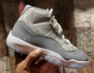
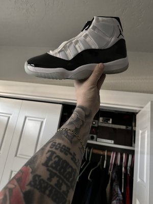
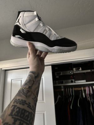
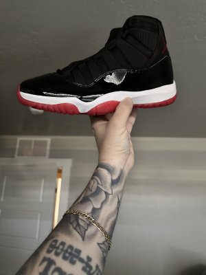
11: 11’s are in a great spot with just small improvements needed. I’d LOVE to see Concords, Breds, and Jams comeback again with that angular OG toe box. #23 on the Cords, and the correct shade of red on the Breds outsole. That candy apple red on the OG is everything. Wouldn’t mind thicker patent cuts either but probably asking for too much. All in all this model is in a very good spot.
12: shape is getting better but still a ways to go on that bulky build the OG had. Also, they need to start using better leather on these. Recent white/reds are a good retro but they didn’t knock it out of the park quite like the Playoff 13…
13: last Playoffs were outstanding. Not perfect to the OG, but VERY close. Use better leather, make the toe just A LITTLE lower, and refine the wrapping panels that go to the back of the shoe slightly, and you basically have the OG. Next black/reds MUST have this mold AND the correct shade of red!! Bred 13’s are one of my grails and how the next release turns out is super critical for me.
14: shape is off a bit on these still, they lack that aerodynamic, sleek look the og has, though they aren’t as bad as say the 9’s. Collar height and toe need the biggest changes imo.
Why did he paint the midsoles like FR/TBsBasically these!

Is it me or do those OG 3s have a slanted toe similar to the 4?
Even on feet it looks slanted (which is a good thing)

Whispers....And it's not close...Black Tongues > Fire Reds. Have felt that was since I was a kid, and I'll stand on it.
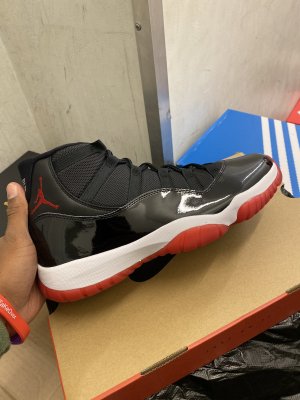
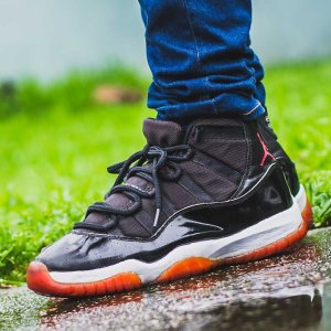
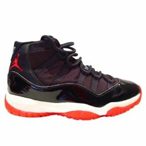
The bred 11 is my favorite shoe ever, I had two pairs of OG’s at one point and owned every retro version except the 2012. The shade of red on the OG is just a thing a beauty, it’s PeERFECT. I love my 2019’s, I have 3 pairs, but it really grinds my gears sometimes that the red sole is too dark on an otherwise great retro.Ive been a lurker here since 09. Found this site as a 14 year old trying to find out how to cop the space jam 11's and have visited ever since. I literally re activated my account to rebound on your point about the 11's. Jordan Brand if you are listening, PLEASE FIX THE TOE BOXES ON THE JORDAN 11'S. Every time i see a 2000 retro or a OG pair it liteally makes me angry I dont own a pair. They look so much cleaner. AND FIX THE RED SOLE ON THE BREDS. That maroon dark red sole ruined the 2012's. You have a great eye for the details.
Yeah they went backwards with the Breds. My brothers pair of concords had the slant toe box, but my pair didn’t. I was working at Champs at the time for the 2019 bred release but idk, when I saw pics of the OGs I just didn’t get the same vibe but it’s cuz the sole was way too dull and the shape was funny. The first pic is my 2019 pair and those are the OG’s. Completely different shoeThe bred 11 is my favorite shoe ever, I had two pairs of OG’s at one point and owned every retro version except the 2012. The shade of red on the OG is just a thing a beauty, it’s PeERFECT. I love my 2019’s, I have 3 pairs, but it really grinds my gears sometimes that the red sole is too dark on an otherwise great retro.
I did notice that one of my concord retros does actually have the angled toebox pretty similar to the OG. None of my Breds have it though. I’ll post up pics later to show the variance.