- 1,982
- 1,284
- Joined
- May 10, 2015
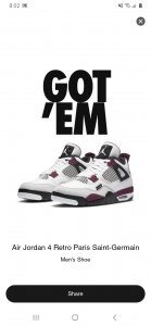
if the fire red 4 wasn't releasing I would be all over this. Not sure now.
Follow along with the video below to see how to install our site as a web app on your home screen.

Note: this_feature_currently_requires_accessing_site_using_safari
Excuses.if the fire red 4 wasn't releasing I would be all over this. Not sure now.
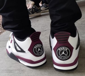
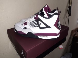
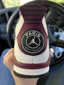
I'm the complete opposite haha. Jumpman logo > PSG logo. The PSG looks so out of place imo. A little tab with 'Paris Saint Germain' on the shoe would be better imoI like the PSG logo about a million times better than the standard jumpman air but still way less than Nike Air. If I liked the Bordeaux color I could see myself copping these
We like what we like! I’m all for everyone liking what they like. What I DONT like are trends and people liking stuff because other people like it. Sheep. Followers.I'm the complete opposite haha. Jumpman logo > PSG logo. The PSG looks so out of place imo. A little tab with 'Paris Saint Germain' on the shoe would be better imo
Word!We like what we like! I’m all for everyone liking what they like. What I DONT like are trends and people liking stuff because other people like it. Sheep. Followers.
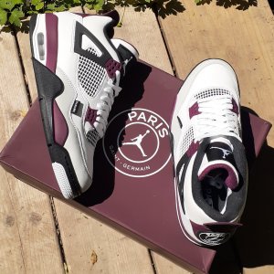
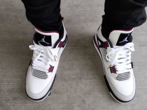
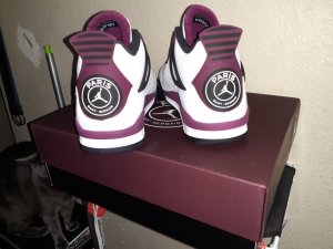
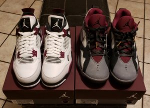
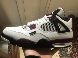
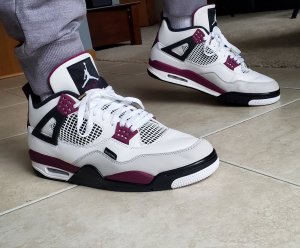
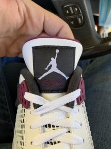
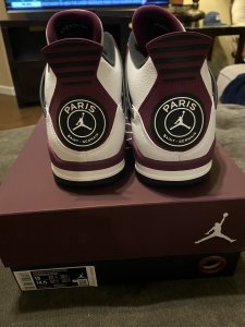
Yea. The “paname” tab on the side and the psg logo on the back are the worst parts of the shoe imo. They could have put paname on the inside of the tongue and the psg logo on the insole. Nike/JB always ODs on logos with their collabs...dope shoes but they always gotta ham it up.I'm the complete opposite haha. Jumpman logo > PSG logo. The PSG looks so out of place imo. A little tab with 'Paris Saint Germain' on the shoe would be better imo

I like them.Looking forward to these but I'm so glad so many people hate them. They're gross, stay away!
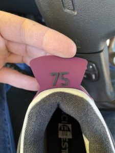
Damn! Wtf is up with the back pull tab?Looking forward to these but I'm so glad so many people hate them. They're gross, stay away!
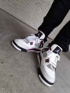
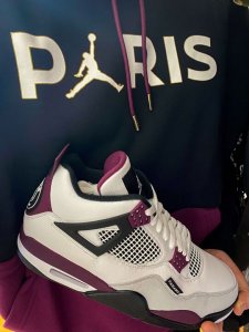
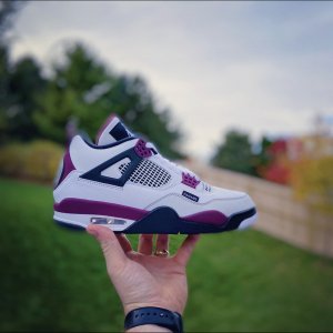
Damn that PSG logo fills the space SO much better than the stupid JM AIR. These pics make me want. LOL damn I think these pics converted me. What’s going on here.Looking forward to these but I'm so glad so many people hate them. They're gross, stay away!