- 26
- 27
- Joined
- Nov 12, 2020
Me likey.
Follow along with the video below to see how to install our site as a web app on your home screen.

Note: this_feature_currently_requires_accessing_site_using_safari
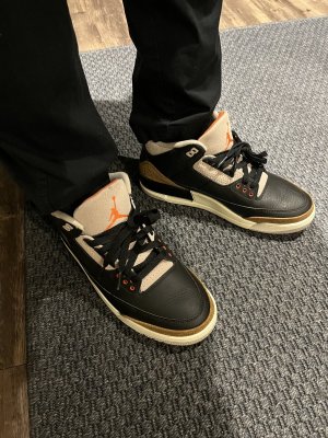
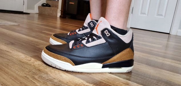
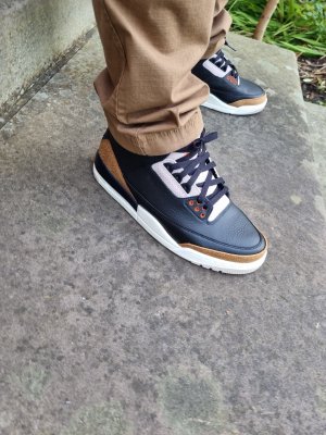
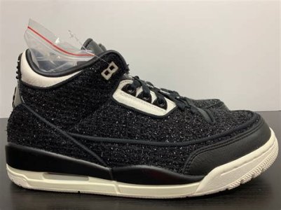
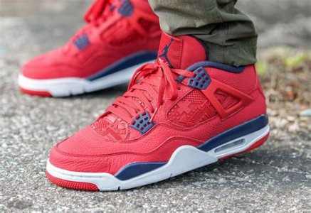
Let’s see if they remain true to the mockup


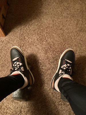
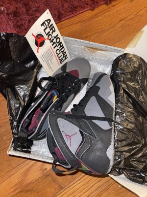
 need a black leather pair of 3’s* Starts
  from now.
These will do until they bring back the real black cements.
Once those drop, imma sell these lol
 lmaoo
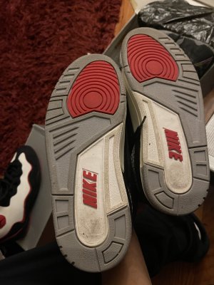
lmaooI maintain that these will be extremely hard to get for retail and the resell prices will be in the $350 range.

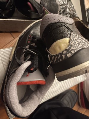
Never cared for Black Cement 3s -- borderline can't stand the sight of them.
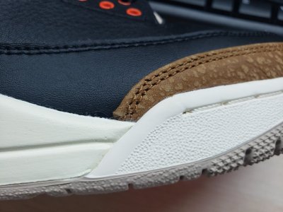
The mockup of the upcoming revision, however? Killer.
I think that the cement grey elephant print doesn't jibe with the black leather upper, making for a sneaker that is overdone and dull at the same time.why tho
Never cared for Black Cement 3s -- borderline can't stand the sight of them.
The mockup of the upcoming revision, however? Killer.

Never cared for Black Cement 3s -- borderline can't stand the sight of them.
The mockup of the upcoming revision, however? Killer.

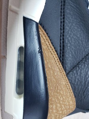
If an aged BC3 is what they are going after I am fine with that. But NA branding better be on the back of those shoes. Or I am not at all interested.
Maybe so. But ultimately NA was on the original and that's what most prefer if the choice was theirs. From a design stand point, the NA just fills that space in the back better imo.If the JOrdan logo was the OG logo, instead of the Nike Air, would you still feel the same way?
Sometimes I think if that had been the original logo, people would constantly complaining about the JOrdan logo not being used.