NBA Logo ReDesigns - Who has it right - Who has it wrong?

I guess this means the sleeves are here to stay. Ughh.

But hey at least we get to look forward to being able to buy our new Nike NBA jerseys with the authentic Progressive Insurance ad patch.
 
Last edited:
I like the fact the sleeved on is based on their old warmups, but I hate the sleeves as well. Wish there was UTAH written above the Jazz like how it used to be in the 90's though
 
Dunno why, but I love the Hawks logos.

kd1tvy03opryj8ynnd2m.png


Simple and clean.

Bucks ones are fire too.

635708580622340727-1581144799_BucksLogo2015[1].jpg
 
Last edited:
They need to give that name back to New Orleans. Have other nba teams have names that make sense too. Give the lakers name back to Minnesota.

It's to late to give the Lakers name back.

The Jazz should give it back though.
 
okc should be the outlaws..

lakers shouldn't be the name of an LA team.. and jazz shouldnt be the name of the Utah team
 
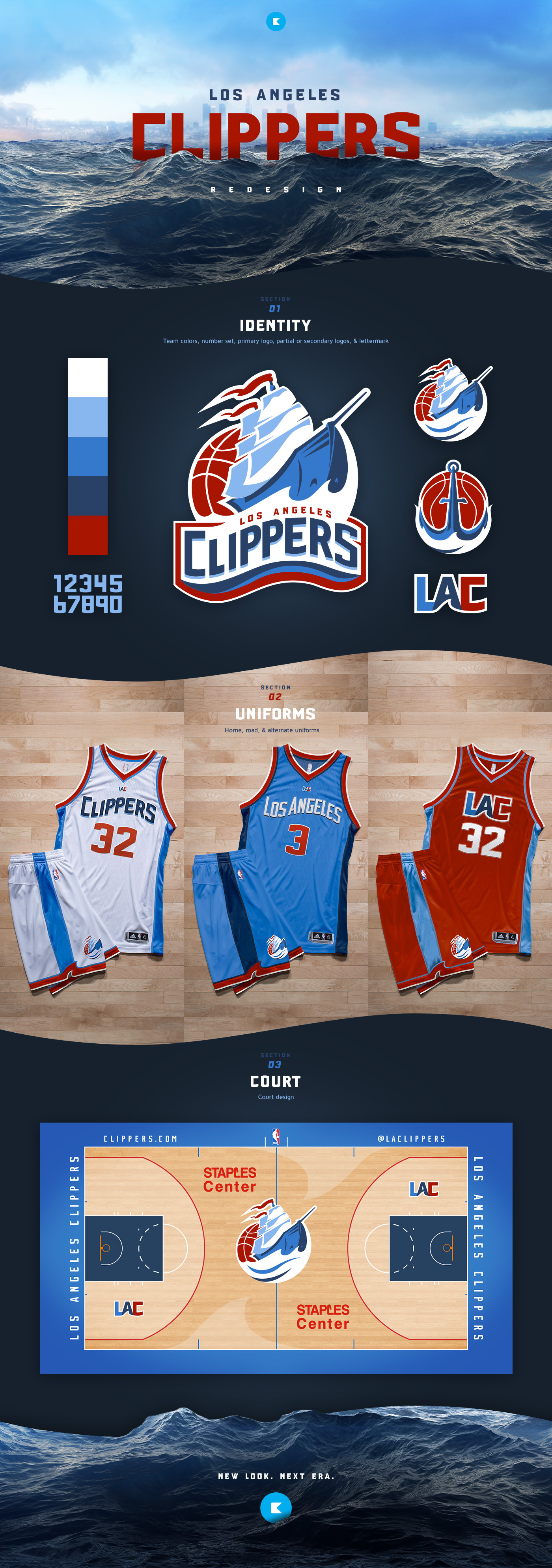
That fan deserved whatever money the clippers paid the designer who made their current logo got paid. The most basic crap someone could draw up without any style.
 
The Jazz new uniforms are nice. One things for sure, cant wait for Nike to get the NBA back so we can do away with the stupid sleeved jerseys for good!
 
Current Mavs logo is the best of the rebrands. Warriors is definitely really fitting too.
 
the Clippers are on of a few teams that can really only do red/blue, well may orange-red and seafoam or something

they're my favorite team, but I refuse to buy this new merch.  They have such a good base to work with too

I think I went a little too nautical on these

27zkxkx.jpg


33epfer.jpg


they look like 1920's swim suits

3613712229d10a3ad14882b5fe5cce79.jpg
 
 
Back
Top Bottom