- 396
- 147
- Joined
- Nov 3, 2015
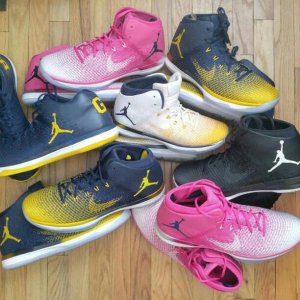
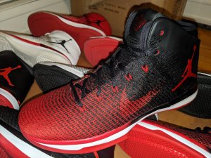
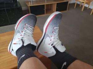
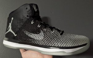
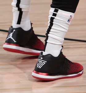
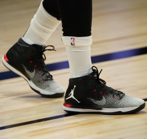
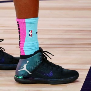
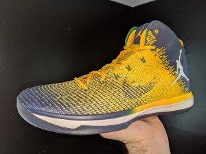
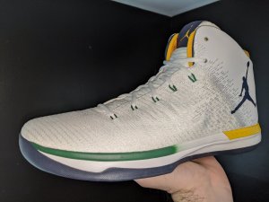
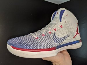
It's a very plain safe design but very ugly logo placement as others said. More super fly or Hyperdunk looking than a Jordan in my opinion
Follow along with the video below to see how to install our site as a web app on your home screen.

Note: this_feature_currently_requires_accessing_site_using_safari


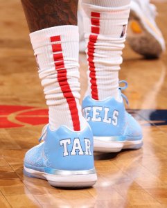
SC kid how you gonna buy the fencing and glory goles and not like these tho
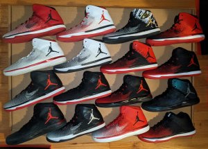
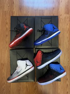
These are actually better looking than those two IMO
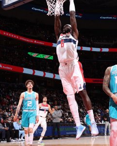
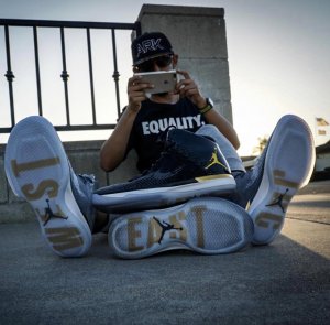
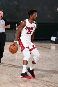
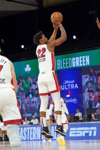
that damn jumpman mannn...
All the wait for this? How much did Nike pay JB to advertise on their shoe? Thought they were selling ads on jerseys not shoes
All the wait for this? How much did Nike pay JB to advertise on their shoe? Thought they were selling ads on jerseys not shoes
CP3.10 remains the best new shoe that JB is putting out this year believe it or not from what I seen. [emoji]128064[/emoji]
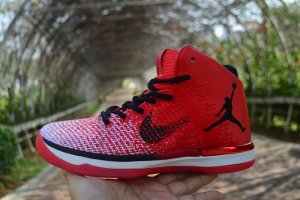
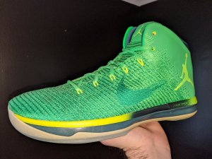
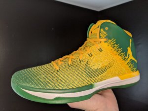
Jordan Brand apparently wanted to make a worse looking shoe than the Chef Curry 2s so they put out these 31s.. Trying to upstage UA at everything lolHmmm...These or the "Chef Curry" 2 lows? Such a tough decision.
Jordan Brand apparently wanted to make a worse looking shoe than the Chef Curry 2s so they put out these 31s.. Trying to upstage UA at everything lol