Thoughts on these tee shirt designs? Morbid Hype

51
35
Joined
Jun 19, 2014
Hey NT, i have been working on a few designs for the company I started up. I was originally going with shock and awe, but decided to move in a slightly different direction.

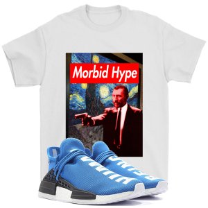
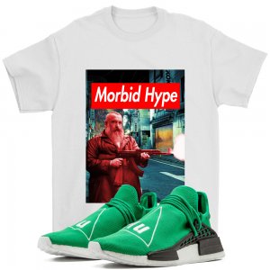
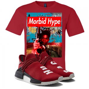
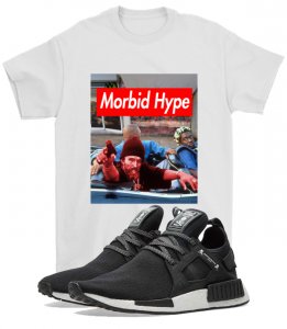
I call this set the Artist's Commemorative Tribute set featuring a mix of deceased artists with pop culture influenced movies. I have a handful I am brainstorming about but here are 3 designs I finished.

Don't mind the NMDs, I use them for the IG pictures.

Thoughts pointers suggestions are highly welcomed.

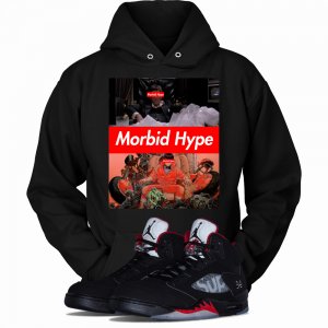
If you want to check out the other styles look up the acct on IG or the website.
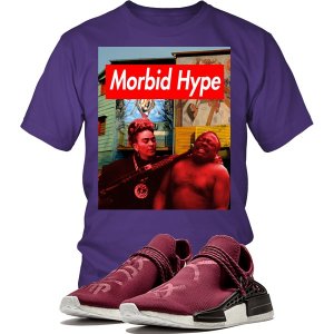
 

Attachments

  • VANGOGHBLUENMD.jpg
    VANGOGHBLUENMD.jpg
    204.6 KB · Views: 114
  • War Dog Monet.jpg
    War Dog Monet.jpg
    563 KB · Views: 114
  • basquiat.jpg
    basquiat.jpg
    639 KB · Views: 108
Its look like a Supreme shirt with a picture behind the logo. Its bold, I'm guessing geared towards a younger demographic because being 31 I can't see myself in anything like that.
 
Looks like a blatant Supreme knock off.

Are you really serious about fashion or you just want to sell screen printed tee's?

EVERYONE sells those so it'll be hard for you to get in that IMO.

Do you have any actual stitched clothing?

A unique fit?
 
Supreme box logo inspired shirts have been done for over a decade. The shirt can do with out it. I would also make the shirt designs full print.
 
Thanks for the input. So i should drop the box logo, thoughts on the concept? Im not serious about becoming a fashion designer, I just want some clean new designs. I'll leave the custom stitching and distressing to people with the time and resources. Not to say that I wouldn't mind selling those types of products but in the end that wouldn't be my goal.

The main demographic would be teens to late 20s. I like the designs but wouldn't really wear them unless it was to a sneakercon for the flash.

The big box logo is something I wanted for the first couple of releases to catch the viewers sight and make the name easy to remember. I still like the box logo but would make it smaller into a corner IF a kept it.

Essentially i want to step away from the supreme nite into something different once the brand starts catching some momentum.
 
Last edited:
that box logo been played since Shortypop

i suggest checking out Barbara Kruger's style and working from there instead of the brand that bit off her
 
I work with different brands on IG to wear and model clothes and im very picky on what I choose to accept. I woudnt even answer your DM.

Its a played design that wont sell, not tryin to be mean but it is what it is.
 
It's not that I don't like my designs, I too old (mid 30s).l for some of the themes. Here is another couple of styles. As mentioned initially it was a shock and awe approach. The dark side of the whats popular (burning fakes, crumbling, burning supercars, mob hits, etc).

I was using a horizontal design and for the same price couple get more coverage and decided to work with a vertical design. When I started the vertical design I shifted the theme.

For the vertical design I used some of Barbara's inspiration. At the end of the day its a lot of it is in making designs or themes that my 10 year old could wear to events, since he wears alot of spraygrouns/pop culture inspired clothing.
 

Attachments

  • hoodie.jpg
    hoodie.jpg
    442 KB · Views: 32
  • Mobid Hype burnyeezy.jpg
    Mobid Hype burnyeezy.jpg
    772.5 KB · Views: 30
Here is a Dominican themed shirt for Mero that he wore on the show. Did a 50 shades of Sosa for ****s and giggles.
 

Attachments

  • 20902729_1704286206545542_8355905384568848384_n.jpg
    20902729_1704286206545542_8355905384568848384_n.jpg
    144.5 KB · Views: 41
The hoody wouldn't be so bad if you didn't have the logo on the front 3 times. Just leave it over Scarface's eyes and you could sell it to somebody. Not me but somebody would buy it.
 
It's not that I don't like my designs, I too old (mid 30s).l for some of the themes. Here is another couple of styles. As mentioned initially it was a shock and awe approach. The dark side of the whats popular (burning fakes, crumbling, burning supercars, mob hits, etc).

I was using a horizontal design and for the same price couple get more coverage and decided to work with a vertical design. When I started the vertical design I shifted the theme.

For the vertical design I used some of Barbara's inspiration. At the end of the day its a lot of it is in making designs or themes that my 10 year old could wear to events, since he wears alot of spraygrouns/pop culture inspired clothing.

You would allow your 10 year old to wear "mob hit" themed apparel? :stoneface:
 
You would allow your 10 year old to wear "mob hit" themed apparel? :stoneface:
getback getback That specific style wouldnt be for him, its more for people who are into ogrish. Back in the late 90s/early 00's the second hand apparel store in the east village called seek and destroy would have the most disturbing shirts for sale, it always left an impression and that was the goal with the mobhit design (shotgunface).

@jayhood I've sold a few of that design, I call it boss talk
 
the name of the brand is stupid.
Why is that? Initially it was about the bad in the industry.

Morbid: unhealthy interest in disturbing , unpleasant subjects.
Hype: Promotion and exaggeration of importance

The Artist wielding guns is a mixture of popular culture with darkness of violence. You can argue that the legacy alot of artists leaves far surpasses anything they could ever imagine while they were alive. Basquiat, Monet, Van Gogh whose paintings have sold in the tens of millions, their paintings are more like WMDs.
 
Last edited:
i know the definitions of the individual words. any thoughts on formulating a brand name that contains the word "hype" should be nixed. the word "morbid" also seems like a trying too hard type of word. as far as the designs go, i wouldn't wear those shirts even if i were homeless.

bottomline is it doesn't matter what i think. if you want to build a brand, you have to be committed to your vision and do your thing. lots of people on NT hate neek's designs but that dude is rolling in cash and doin it big.
Would Xarzy make a better name for the clothing brand?
 
Back
Top Bottom