- 612
- 83
- Joined
- Jan 25, 2013
Only ones complaining are people who only rock kicks. No hoop abilities. These fire flame
Follow along with the video below to see how to install our site as a web app on your home screen.

Note: this_feature_currently_requires_accessing_site_using_safari
Who is complaining about that?It's funny that people are complaining these to be plain while we had more people complaining back then about radical air jordans designs like the 20, 2009, 2010, 2012 - xx8
I like them in general, but not as AJ31. I don't think they'd should have modeled it after the 1
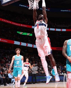
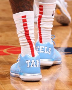
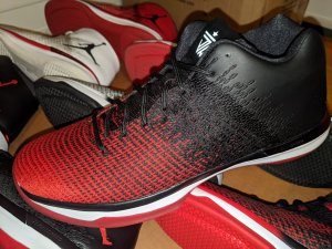
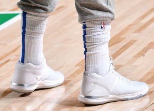
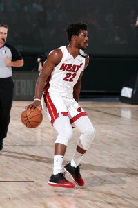
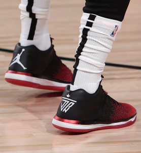
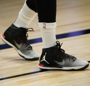
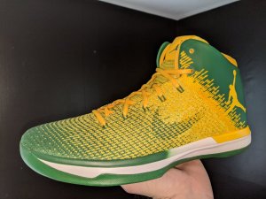
View media item 2106733
 FlightSpeed
I'm turning a lil bitI like them in general, but not as AJ31. I don't think they'd should have modeled it after the 1
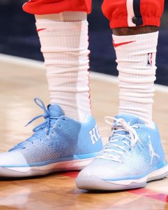
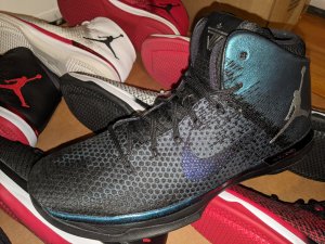
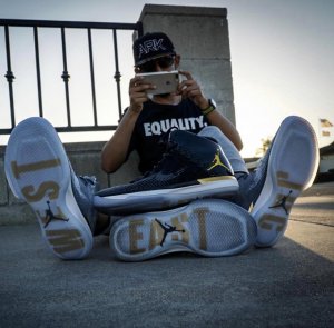
View media item 2097362
Who is complaining about that?
Oh nevermind, 1 person said it. Im pretty sure we can all agree that the simplicity of todays air jordans is a lot more appealing than what they were doing before the 29s.
These days the main complaint is the Jumpman. On the 29 it was too big or there were too many, the 30 it was on the f'n toe, now on the 31 its slapped willy nilly on the side of the shoe.
You would think this would be negligible compared to the garbage designs we were getting from the pre-29s. However, it's equally annoying. Its like going from a fat chick with a hot face to a hot body with a butterface.
Ok I understand the dual branding, but they could have made the jumpman smaller. The wings logo is small. They should have updated the wings logo and placed a newer version there. Anything but that big *** jumpman

Right?No need to tune into the stream....
Right?No need to tune into the stream....
Unless they have a little something special while streaming live, then the RSVPing was unnecessary
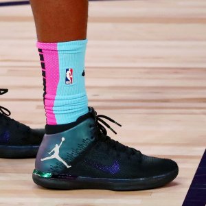
I'm hoping they'll show other colorways during this reveal...
I'm not a photoshop expert, but can someone make the alterations into the other holy trinity/quartet colorways please?