- 1,366
- 959
- Joined
- Jan 21, 2013
something a little different...


Follow along with the video below to see how to install our site as a web app on your home screen.

Note: this_feature_currently_requires_accessing_site_using_safari
Always watch the edges of your frame. You are chopping them off at the fingers and hands.
The processing is a bit HDR-ish because you probably shot this either exposing for their skin or for the super bright sky. IMO its okay to blow out the blue sky to white to make the skin correct. Its technically incorrect exposure but its an "in" look right now.
Solid picture though. I'm sure they're more than happy with what you delivered.
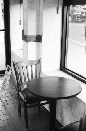
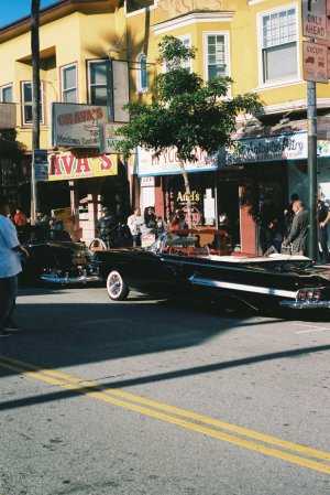
#nyc #newyorkcity #newyork #made_in_ny #brooklyn #manhattan #queens #streetphotography #street by Michael Rios, on Flickr
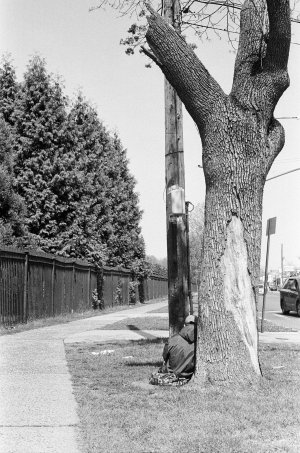
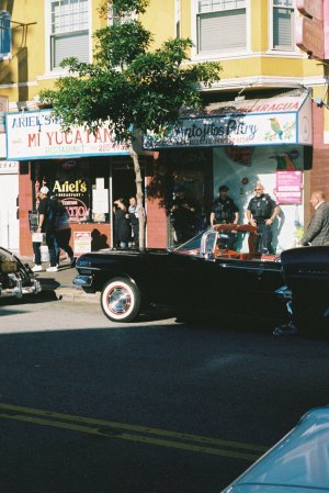
#nyc #newyorkcity #newyork #made_in_ny #brooklyn #manhattan #queens #streetphotography #street by Michael Rios, on Flickr
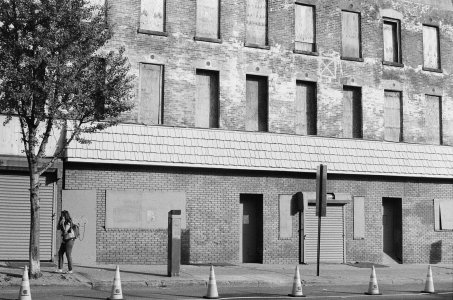
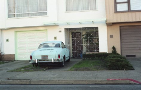
#nyc #newyorkcity #newyork #made_in_ny #brooklyn #manhattan #queens #streetphotography #street by Michael Rios, on Flickr
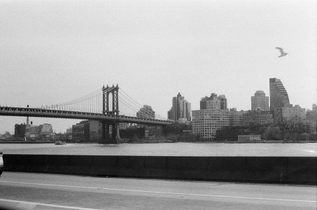
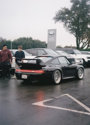
#nyc #newyorkcity #newyork #made_in_ny #brooklyn #manhattan #queens #streetphotography #street by Michael Rios, on Flickr
#nyc #newyorkcity #newyork #made_in_ny #brooklyn #manhattan #queens #streetphotography #street by Michael Rios, on Flickr
#nyc #newyorkcity #newyork #made_in_ny #brooklyn #manhattan #queens #streetphotography #street by Michael Rios, on Flickr
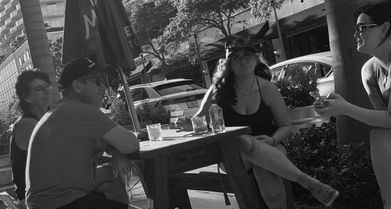
BrinzosPalace by ryan g, on FlickrIs this before or after editing?
BrinzosLadies2 by ryan g, on Flickr
BrinzosPalace2 by ryan g, on FlickrWord up @Fongstarr,iamdef thanks y'all for keepin that feedback rollin. I really do appreciate it as I won't get any better without it.
some quick edits of the edits based on what y'all was sayin...

SouthCityDon......I am not sure if I am making a generalized statement but your photo editing and picture style on portraits seemed heavily influenced from taking landscapes. Trust me....I do it all the time and can't seem to break it sometimes. I think the edits look good! In normal cases, I wouldn't always agree to crop out so much like you did on the 2nd pic but because the background didn't show the structures that clearly, I think it works.

SouthCityDon's landscape photos are insane
This would be a killer metallic print!!I'm loving the new Photoshop - does a bunch of things which my older version couldn't.
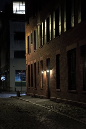
New B&W conversion of this which I took in January.
no generalization at all in my case Fong...I am fightin myself somethin wicked with this editing of these portraits and all based on what I am used to doing with landscape.
gonna work at it later to keep it real basic...
any tips/suggestions or youtubes to watch in terms of simple portrait editing would be appreciated!

I might be generalizing, but looking at the portraits you posted, if I had to guess what happened is that you had the models to dark with the natural light, and really raised the shadows in post. I think that is why they are looking a little funky. I like the photos though. I'd get a reflector, and even in the shade, you can get some nice fill light with it at your feet (no assistant needed)thanks fam!! 'preciate that...this one little gig has me thinkin I'll stick to landscape!!
much respect to y'all portrait gurus!!!SouthCityDon's landscape photos are insane
no generalization at all in my case Fong...I am fightin myself somethin wicked with this editing of these portraits and all based on what I am used to doing with landscape.
gonna work at it later to keep it real basic...
any tips/suggestions or youtubes to watch in terms of simple portrait editing would be appreciated!