- 61
- 338
- Joined
- Jul 11, 2021
Parra Custom

Follow along with the video below to see how to install our site as a web app on your home screen.

Note: this_feature_currently_requires_accessing_site_using_safari
Then/Now:

 hypebeast.com
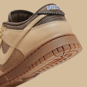
Word, the contrast is even more flagrant in person, new one nearly orange. I swear Nike be doing dunks/sneakers for Instagram now. First thought when I peeped the color when opening the box was "damn, saturated market, saturated colors" smhThe lighter tone of yellow on the 99s are way better then the newer release.


Today:
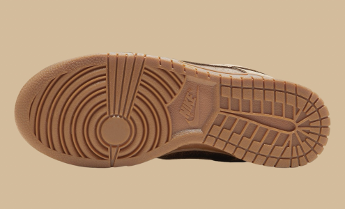
Naw. The Swoosh is 3M, but the 3M is like a purple hue/tint. The rub away parts are down the eyelets, and the the wrap around toe rand.That paint on the swoosh and panels rub away right?
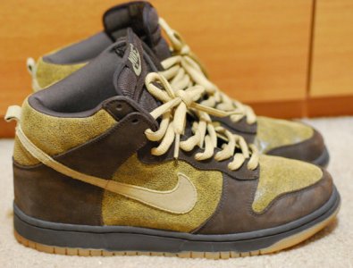
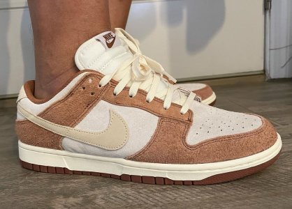
Where did you find the Red/Gold colorway?My recent low-top pick-ups.
Gonna need some brave soul to rub it off. need to see the purp under there before deciding how hard i go at themNaw. The Swoosh is 3M, but the 3M is like a purple hue/tint. The rub away parts are down the eyelets, and the the wrap around toe rand.
Stockx a few weeks before release.Where did you find the Red/Gold colorway?


Absolute need.
I'm with you. But that minimalistic design style is in vogue right now. We already had the big loud oversized graphic phase.I'm not trying to knock you, it's just that some of the apparel people really go for confuses me. The design is very plain, which isn't a bad thing but the shark is so small, from a design point there is so much negative space. The hood strings will cover it most of the time. Maybe there is something on the back to break up it up.
If it were me designing it I'd offset the shark to the right, and make the cuffs/waist either red or half red/white horizontally.
I see what u mean but wouldn't there been a chest shark at all i wouldn't even be tripping since the small hood one really makes it pop to me. Simple design indeed, minimalist even, i ain't mad at that at all.I'm not trying to knock you, it's just that some of the apparel people really go for confuses me. The design is very plain, which isn't a bad thing but the shark is so small, from a design point there is so much negative space. The hood strings will cover it most of the time. Maybe there is something on the back to break up it up.
I'm with you. But that minimalistic design style is in vogue right now. We already had the big loud oversized graphic phase.
It'll come back though.
I see what u mean but wouldn't there been a chest shark at all i wouldn't even be tripping since the small hood one really makes it pop to me. Simple design indeed, minimalist even, i ain't mad at that at all.