NBA Logo ReDesigns - Who has it right - Who has it wrong?

13
10
Joined
Apr 6, 2016
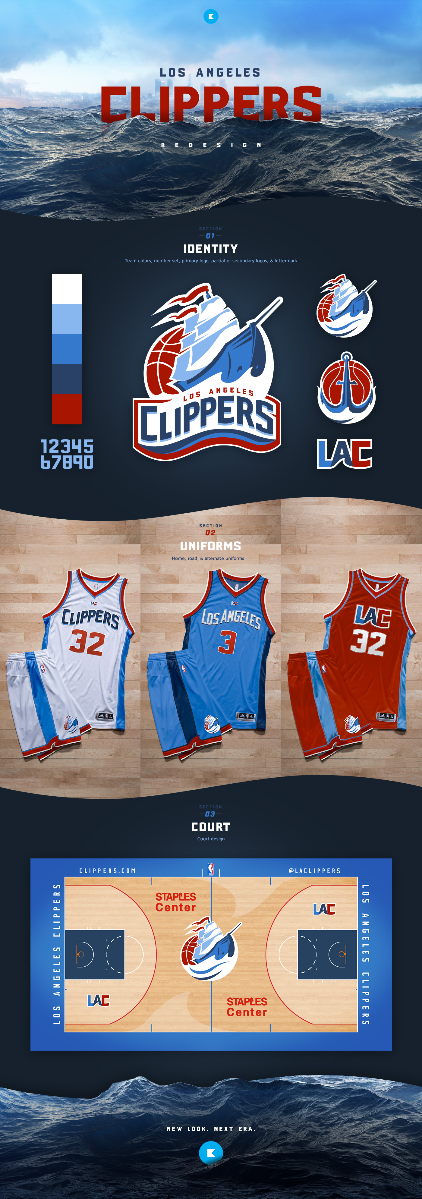
Some discussion in another forum had me thinking of past NBA logos and the apparent designs that have failed, or been successful. Some are successful given a new player, new movement, new ownership etc. What stories do we know of these logos and what they meant for their respective teams?
 
Mavs with the current logo has been sucessful for them and they represent Marc Cuban's ownership . Before when they had the cowboy M, the teams were not very good.

The current Nuggets logo represent the Melo era for the team.

I remember the Cavs unveiled their current logo during lottery when they got the #1 pick in 03'.
 
It's a fairly simple process for the NBA, and most other leagues, if your team has an old history. If you are in dire need of a rebrand you revert back to an old logo - or a modified version of it. Look at just the NBA - nearly every team that has done this the past 5,6 years has had kudos across the board from their fans, media, etc. Teams are finally starting to figure it out.

The Clippers rebrand has been a joke, the Rockets rebrand ten years ago also has a terrible look.

Will be interesting to see moves made once Nike comes in.
 
the warriors one is the only good logo... the older logo of the other teams look way better imo
 
a1f0a127846499.5636bb9189452.jpg


The Clippers ****** up a great opportunity.
 
Way better than what the clippers have now. Whoever chose the current logo and design are idiots.
 
[quote name="RyGuy45"]
The Clippers rebrand has been a joke, the Rockets rebrand ten years ago also has a terrible look.[/quote]

They definitely stick out as the worst 2. The Clippers' is just turrible.
 
When Hornets' name finally came back, their new logo and court design look really good
 
Clippers magic rockets and jazz all mucked it up. Everyone else did a good job modernizing their logo.
 
Clippers shouldve just been like da lakers and never change their joint cuz their old one was classic lookin...
 
That Clippers logo is so much better than the one they ended up using. I have no idea how they could end up choosing something that ugly. I think they were hoping that the "LAC" would become iconic or some ****, like the "NY" from he Yankees logo..

I can't believe that a franchise called "Thunder" with all the cool logos they could've made has a logo that looks like a friggin detergent brand.

They even choked in their logo selection process. Probably had like 4-5 really sweet logo designs right before the final selection of the logo, but then some high ranking official came in and said "Nah, we're gonna do it my way and my way only" before disregarding the suggestions from his employees and ended up picking that crappy logo.
 
Last edited:
Just with a quick glance, the only old logos that sucked were the Mavs, Cavs, and Nuggets
 
Clippers re-design is obviously a 'we have to change something' type of re-design... I guess it went with their image on the court also, but it might be time to bring back some history! The old logo had some depth at least.
 
I like the Hornets rebrand:

View media item 2030231View media item 2030230View media item 2030232
I can't believe that a franchise called "Thunder" with all the cool logos they could've made has a logo that looks like a friggin detergent brand.

They even choked in their logo selection process. Probably had like 4-5 really sweet logo designs right before the final selection of the logo, but then some high ranking official came in and said "Nah, we're gonna do it my way and my way only" before disregarding the suggestions from his employees and ended up picking that crappy logo.

The Oklahoma City Thunder are talking to Nike about potentially changing their logo for the 2017 season, reports Grantland’s Zach Lowe.

Nike signed an eight-year deal in June to replace Adidas as the league’s apparel provider beginning in 2017.

According to Lowe, Nike wants to overhaul the entire Thunder logo, but the team remains committed to their triangular shield. They may get rid of the streaks that run across their logo, which are supposed to represent bolts, in favor of something more clearly representing weather.

“To some extent, we are committed to the idea we have,” Brian Byrnes, the Thunder’s senior vice-president, told Lowe. “But we would not dismiss good feedback, particularly from Nike. We’re open to modernizing the logo, but we don’t have an appetite to overhaul it.”

http://www.si.com/nba/2015/09/08/oklahoma-city-thunder-logo-change-nike
 
Last edited:
I like them. The font on the green jersey could be way better. The sleeve jersey is garbage though.
 
Back
Top Bottom