- 9,089
- 31,667
- Joined
- Dec 29, 2003
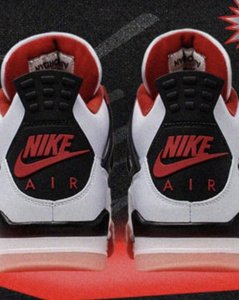
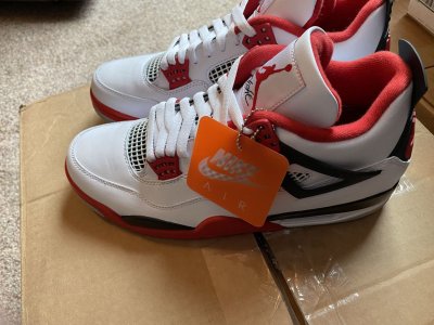
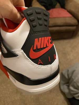
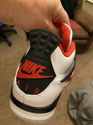
They fixed the Nike Air and centered it properly.
No they didn't.
Follow along with the video below to see how to install our site as a web app on your home screen.

Note: this_feature_currently_requires_accessing_site_using_safari
They fixed the Nike Air and centered it properly.
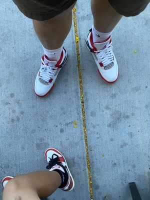
Yeah I want the fire red. The color of red is a huge deal. ****ing huge. I won’t cop if it’s too dark a red. Period. **** manI think the 13 a few years ago truly brought back the true red shade. The XI? No, it looks more varsity to me. These 4s have a more Varsity red than a Fire red. Pics show that. Again the red is a big deal.
I’m not asking for exact duplicates to be able to cop but the shade of red better not be dark I will say that goddamnit.I'm fine with them. We'll never get exact duplicates. We should all know this by now. Just like the black cement IVs, I'm in for 2 pairs.
I don’t think it’s fixed, unfortunately.
Maybe its the picture, but they look centered to me.No they didn't.
I thought so too at first glance but you can clearly see the R in “AIR” is off to the right of the E in “NIKE”. I think it looks less bad because it’s red on black rather than the light gray on the black cements, which is such a contrast that it makes it stick out more.Maybe its the picture, but they look centered to me.
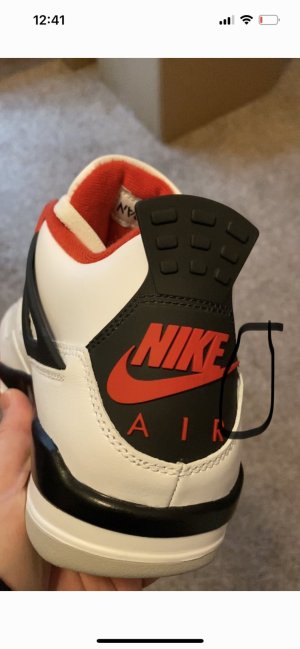
Here’s where I have some hope, look at the top left point of the N, on both shoes and where it lines up with the bottom left bump of the top part of the tab. There is definitely a difference there, to where the Nike looks more aligned with that than the BCsI thought so too at first glance but you can clearly see the R in “AIR” is off to the right of the E in “NIKE”. I think it looks less bad because it’s red on black rather than the light gray on the black cements, which is such a contrast that it makes it stick out more.
You’re right it’s different. If you look at the A and how it’s aligned to the N it’s definitely moved to the left a bit. I still think it’s a little off but whatever. I learned to ignore it on the black cements.Here’s where I have some hope, look at the top left point of the N, on both shoes and where it lines up with the bottom left bump of the top part of the tab. There is definitely a difference there, to where the Nike looks more aligned with that than the BCs

It’s better that’s for sure. I will take it.Maybe its the picture, but they look centered to me.
Tech Red
Stupid Gentry. Bozo.Tech Red
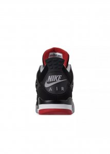
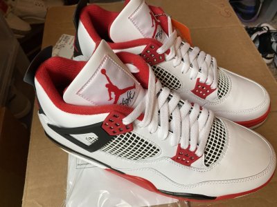
based on this pic... tongue height and toe rand are the biggest issues. these are copped tho.
stitched these side by side
I thought so too at first glance but you can clearly see the R in “AIR” is off to the right of the E in “NIKE”. I think it looks less bad because it’s red on black rather than the light gray on the black cements, which is such a contrast that it makes it stick out more.
based on this pic... tongue height and toe rand are the biggest issues. these are copped tho.
Well, I passed on them.did tech grey throw yall off from the 2016 white cements? yall sound silly af rn


the R should end right below the E top dash lineHere’s where I have some hope, look at the top left point of the N, on both shoes and where it lines up with the bottom left bump of the top part of the tab. There is definitely a difference there, to where the Nike looks more aligned with that than the BCs

I'm sending my Mars off to StockX today. Now I dont want to if theyre going to change the red.
Thats why I was selling them. I think they're wearable though, these and a pair of Tour yellows from the same year have pretty firm soles.2006, right? Too old....not wearable. I'd sell them before it's too late. Even if you don't get the '20s b/c of the red, the only reason to keep the mars is if you're a hardcore collector and want to have them for the sake of a collection.
Paint will flake off in secondsThats why I was selling them. I think they're wearable though, these and a pair of Tour yellows from the same year have pretty firm soles.
I'm shipping them off.
Yea, I think as soon as you put weight on them the paint will crack, probably on the first wear.Paint will flake off in seconds