- 2,222
- 1,128
- Joined
- Jul 18, 2012
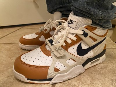
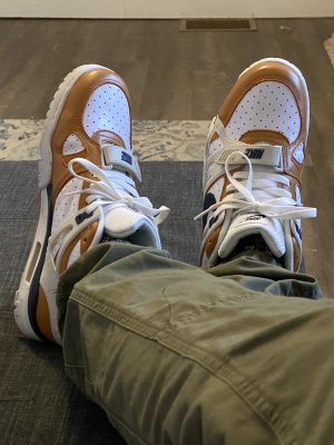
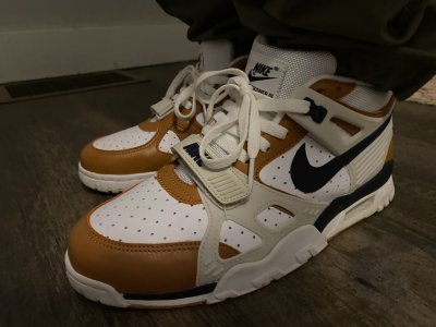
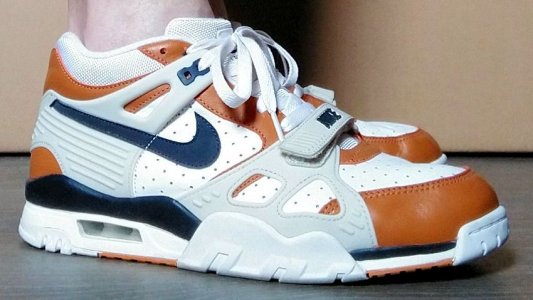
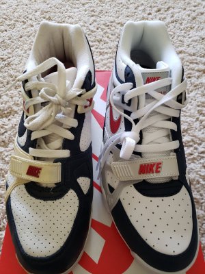
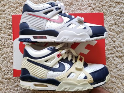
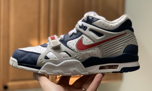
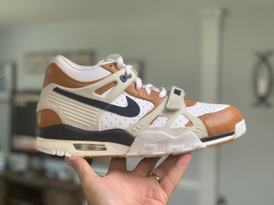
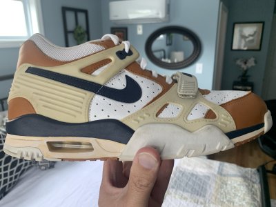
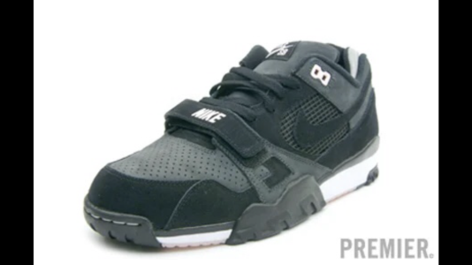
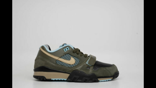
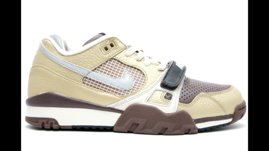
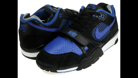
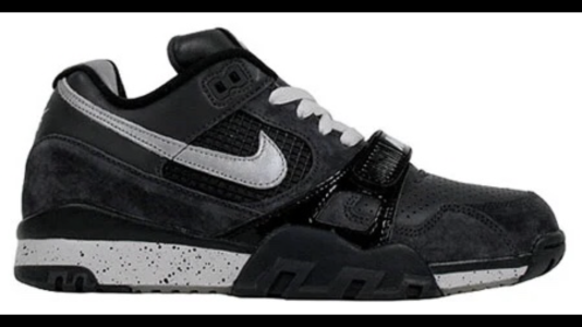
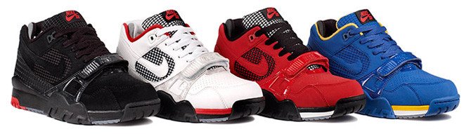
White and blue cross trainer 3 lows are $90 on footlocker (with code save25)
Follow along with the video below to see how to install our site as a web app on your home screen.

Note: this_feature_currently_requires_accessing_site_using_safari
how's the sizing on the recent trainer 3's? still 1/2 size up?
Need these again.

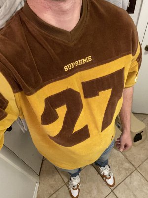
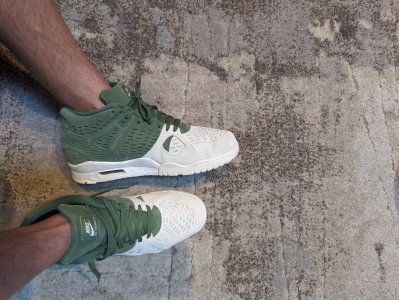
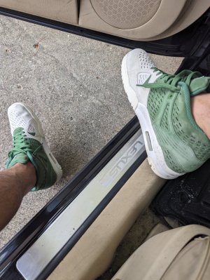
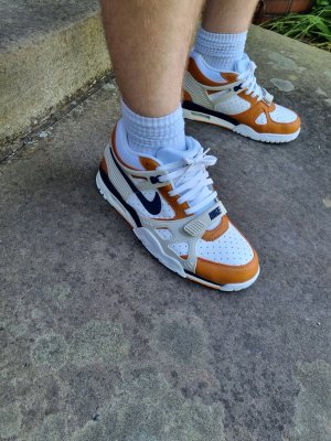
No joke. First thing I noticed. I always wanted the McEnroe era Nike air swoosh socks. I spent decades looking for Nike socks with more than just a swoosh. Now I see them all over online. When did this trend kick back up? I guess they're just Nike essential socks.Sock game on-point.


where you get the socks?Got em Thursday. Wore em yesterday. Materials are ok. The paint used is atrocious. Machine needs to be re-calibrated. But the comfort is good and more importantly the memories......

Got mine at Footlocker. But they got em at Kohl’s too.where you get the socks?
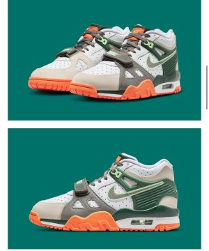
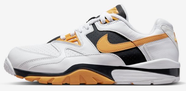
seems like these are only available overseas

Hopefully these drop elsewhere b/c SNKRS may as well not even exist for any sneaker you really want.
Basically lol.
Shops will have them. Hopefully we'll be fine for at least one pair. I want 2-3 total though.