- 498
- 1,762
- Joined
- Mar 11, 2019
Follow along with the video below to see how to install our site as a web app on your home screen.

Note: this_feature_currently_requires_accessing_site_using_safari

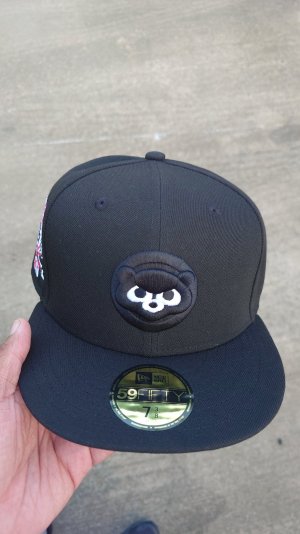
This upcoming MLB x NBA collection from hatclub is probably their most creative effort in a minute. Doubt I’ll pick anything up, but it’s a good change from just putting pink brims on everything.
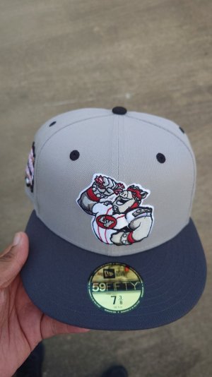
think i want he Rockies/Nuggets hat from this collection.

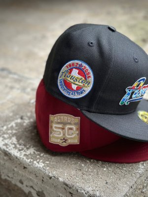
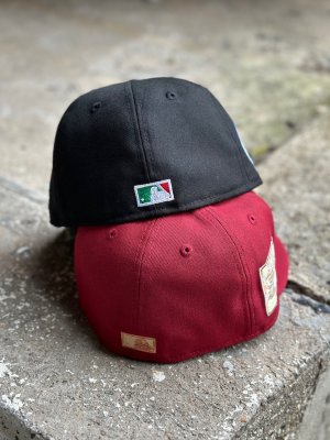
They used the older style. Navy red gold.this is what it'll look like most likely. Old nuggets uni colors
They used the older style. Navy red gold.
They used the older style. Navy red gold.

They used the older style. Navy red gold.


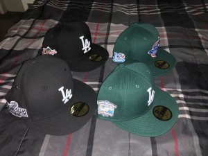
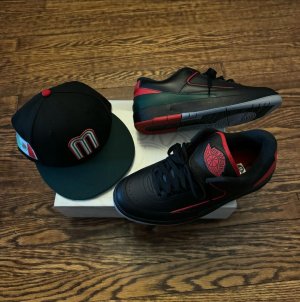
I grabbed 2 of the 3 dodger ones. I missed one because I forgot about themAnyone snag some of them Hatclub nba crossover hats earlier today ?
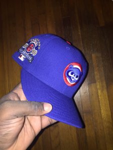
Tempted by the purple Dodgers, might cop it today.Anyone snag some of them Hatclub nba crossover hats earlier today ?
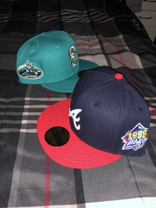
Seattle and ClevelandTempted by the purple Dodgers, might cop it today.
Which ones did you cop?