- 1,596
- 11
- Joined
- Jan 5, 2009
Originally Posted by theblotted
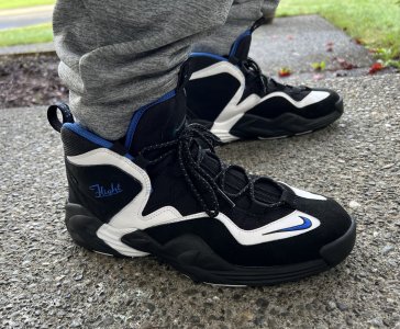
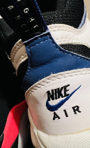
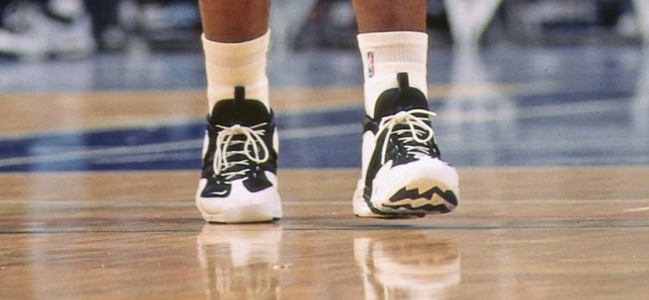
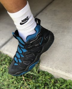
oh and for those wondering about fit - it's true to size, if not a hair bigger.
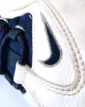
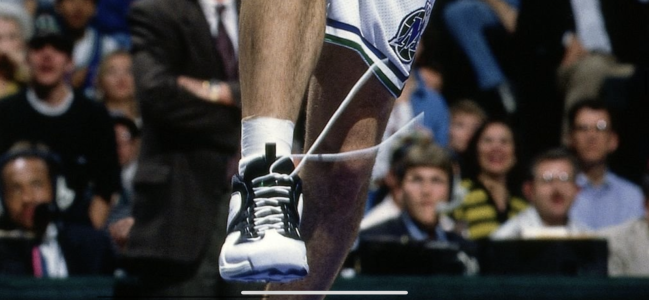
love the quick lace system.
Thanks for the pinks breagham.
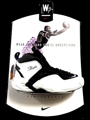
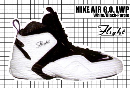
But what's the retail on these jawns?
.
Follow along with the video below to see how to install our site as a web app on your home screen.

Note: this_feature_currently_requires_accessing_site_using_safari
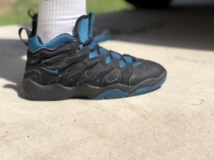
Originally Posted by theblotted
oh and for those wondering about fit - it's true to size, if not a hair bigger.
love the quick lace system.

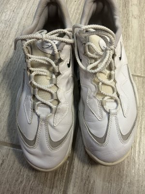
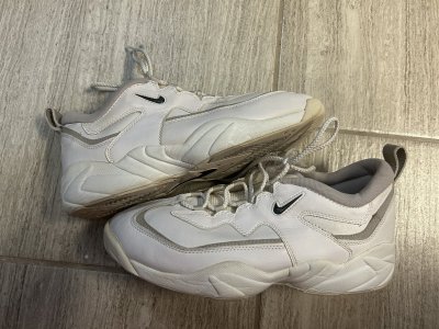
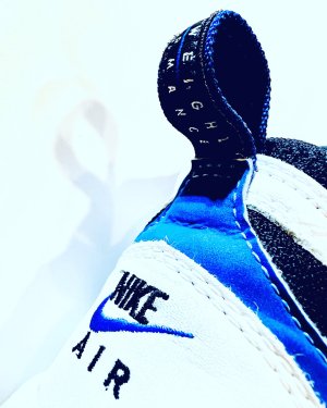
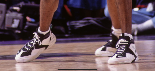
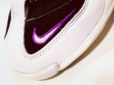
exactly, we're in 2010 now and we don't have the technology to align the paint on point? smh.Originally Posted by jca998
^^
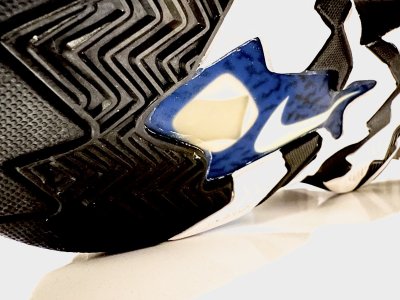
The part about them not being aligned is ok, even though they could have corrected that by now.
But, the blotchy paint on the midsole has no excuse.


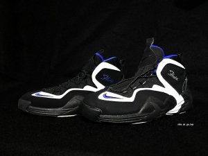
Originally Posted by taicho
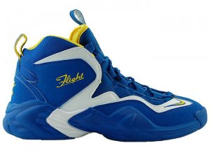
via kenlu http://www.kenlu.net/ http://www.kenlu.net/foru...gt-lt-2010-10_54228.html
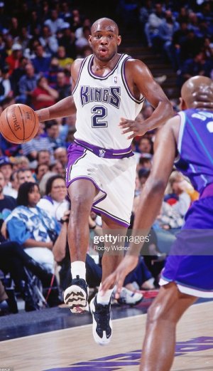
new color ??

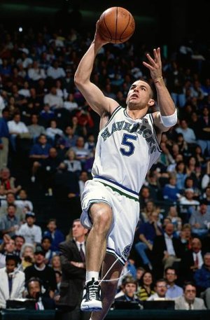
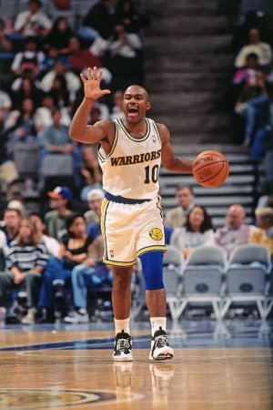
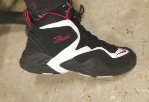
YESSIR.Originally Posted by purplehazen
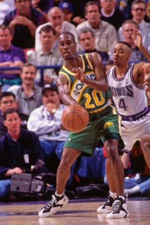
are those at hoh ny? those are dope, tim hardaway was always one of my favorites, killer crossover
Originally Posted by s dubl
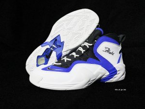
Just a heads up....www.sneaker.st has the orlando colorway for 90 shipped in stock!