Chill Bill
formerly ihaveaquestion
- 3,717
- 2,247
- Joined
- Nov 16, 2014
This was my expression when SneakerBar Posted those new pics
Follow along with the video below to see how to install our site as a web app on your home screen.

Note: this_feature_currently_requires_accessing_site_using_safari
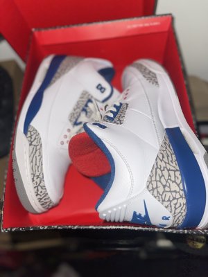
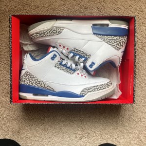
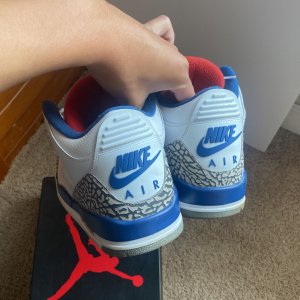
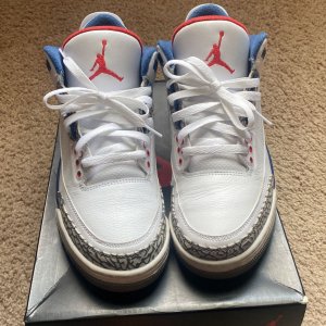
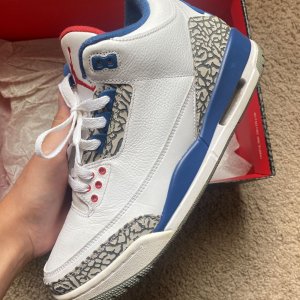
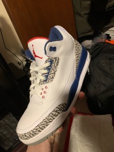
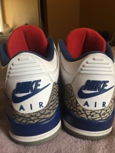
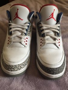
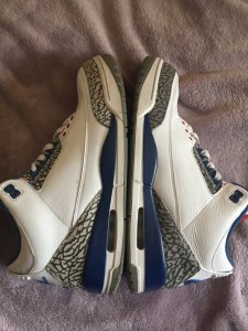
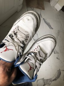
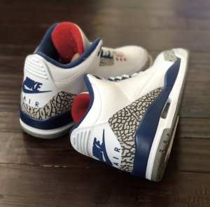
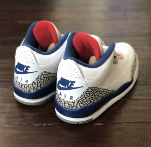
Let them nitpick. They'll still cop.dang the blue looking off now? people trying to downplay this release lol
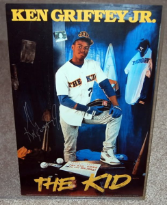
He did wear them once in 88 at a game versus the 1988 U.S Mens basketball team.
for real?? that picture looks shady and FABRICATED
i thought they made that CW when he was with the WIZARDS brah?
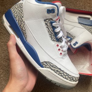
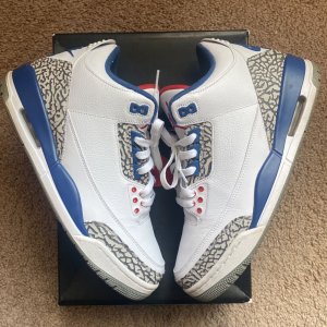
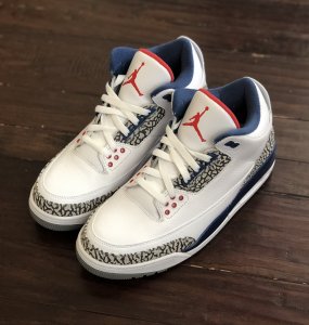
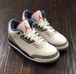
comeon, you have to admit in all the pics we saw it´s waaaay darker then "true blue". I´m waiting on official pics though
dang the blue looking off now? people trying to downplay this release lol
it is definitely the lighting. no way JB is going to release TB3s with a much darker blue and piss everyone offOk. They do look dark in the above pic but for me personally I have to assume that it's just the lighting. To my point, the top pic is full of natural light while the bottom pic is not. Copping regardless.
If you buy into the notion that these will be anything other than True Blue based off one early almost blurry/faded suspect picture, then you're playing yourself and likely just grasping for something to talk/complain about. It's almost as crazy as dudes in another thread claiming the Chicago 1s are trash. People can have an opinion, doesn't mean it's not a stupid one. Kinda ranting now but, yeah.
I like the red tongue liner. It should have never been blue in the first damn place!