The Graphic Design Thread UPDATE: 1st post filled with info. 2nd with NTer's portfolios.

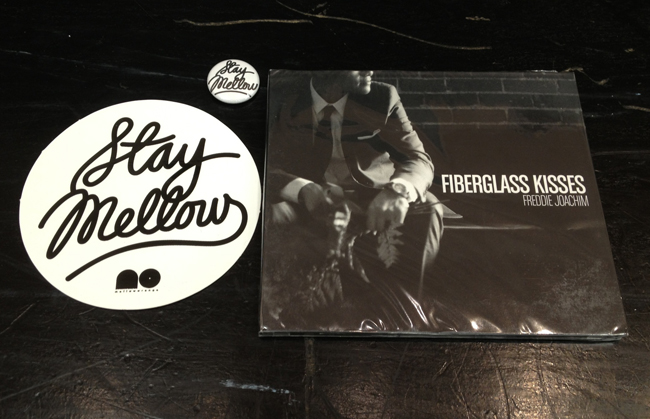
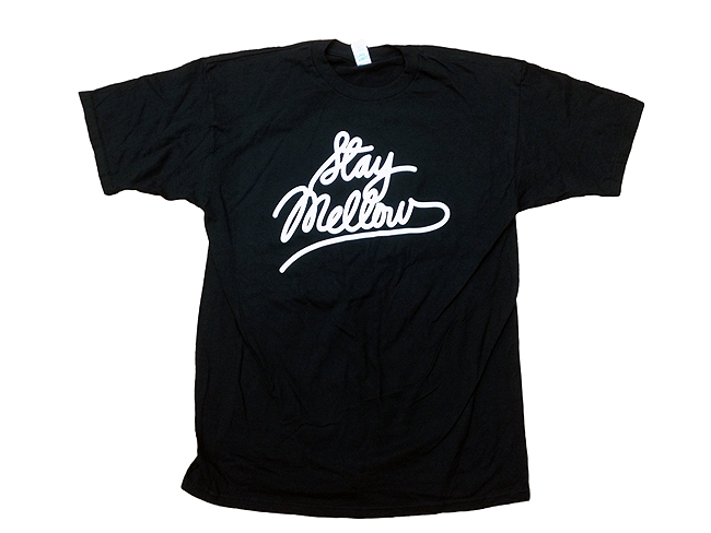
Looks like custom type.


Can someone ID this font?

314007.jpg

Definitely custom. You can always tell when you look at a letter that has been used a lot. None of the "a"s look the same. Thickness and slant all have subtle differences. I would advise a lot of people to try and make your own custom lettering aside from relying on fonts. It just always looks better.

Ok, thanks ya'll.
 
turning that into a typeface proper would take hella work. I'd charge a couple hundred bucks a download for something like that :lol:

You're better off just handwriting whatever you need to say and taking it into illustrator etc. etc.

Anybody actually mess around with fontlab and build something from scratch? It's time consuming as hell after kerning pairs and whatnot, but the reward of using your own fully functional typeface is pretty awesome.
 
Everyone knows it's no-shave November and since I can't grow facial hair, this is my contribution: I will draw a mustache a day for the whole month and at the end of this month I will auction it off via Instagram (@theycallmevince) and I will donate all of it to the fight on cancer. Why? Because I ******g can. I will even throw in a hand written note for the winner telling them how awesome they are.

Check out constant updates on the art on my instagram. Tell others about it.

Tl;DR: Get custom art and help fight the good fight in the fight against cancer because the war on cancer needs funding.

View media item 638080
 
Hello NT designers,

I am current apart of an experiment disguised as a school disguised as an agency—otherwise known as W+K 12.

We are housed within the walls of the Wieden+Kennedy Portland office. Here we don't just learn advertising, we learn to risk it all for the idea or fall flat on our face because great ideas don't come from ordinary means. Here we don't just fail—we fail harder.

My year is (sadly) coming to an end and here are some updates and information for the future failures of W+K12.10.

FUTURE FAILURES OF W+K12.10
 
I can definitely help in critiquing. Web is sort of my flaw but I am can just be a second eye for suggestions. Post them up when you can.
 
I can definitely help in critiquing. Web is sort of my flaw but I am can just be a second eye for suggestions. Post them up when you can.

I'm probably going to move my blog/site from blogger to wordpress and completely overhaul it. I'll basically just have the blog as a part of the site, which will including pages regarding my professional work, contact info, et.c For starters, I'm just looking for a creative mind to assist with a logo, color scheme, etc.

This is my blog :x : romebrown.com
 
Last edited:
^^^^I had no idea you were a graphics major. Honestly I have never really done any extensive illustrator work so that is better than anything I have done. It just takes time and practice....both things I don't have no more. You'll get there. Interning is probably the best as far as working and getting stuff on a portfolio. Unfortunately it's a lot harder to even get those now a days.

I'm probably going to move my blog/site from blogger to wordpress and completely overhaul it. I'll basically just have the blog as a part of the site, which will including pages regarding my professional work, contact info, et.c For starters, I'm just looking for a creative mind to assist with a logo, color scheme, etc.

This is my blog :x : romebrown.com

If you can and know how, use wordpress.org and not .com. Also I swear people are even making Tumblr pages look good now a days. At least you have options to choose when you are ready to do it. I am thinking about hiring someone to redo my blog site. Make it look nice for once since I have the money to pay someone now.
 
^ Thanks, Fong!

I definitely need more practice and experience in a real studio of some sort. I think I'd still like to pursue photography after I graduate and design on the side. Either way, both fields are just as hard to be successful at since they're both so competitive. I'll try to post some more work on here for feedback, etc.
 
@Santi what school do you attend? And how do you feel about going to school vs not going to school to get job placement. Granted a degree will give you some lead way but is the backdoor method as efficient in the corporate design world? Im just not sure if the corporate route shows as much respect to those without the degree unlike the underground, so thats my main ?.

You have some decent work by the way. I too feel like my work is not ready for showing. However, everything Ive learned has been on my own agenda as I have no formal training. Im starting the GD program Spring 2014 at my local Community College and believe Ill be more advanced than the avg freshman since Im familiar working with the CS5 and CS6 Master Suites. Im anxious bc Im sure Ill make a favorable impression and the degree will gain me more respect in some way or another, even if its just me respecting myself for persevering from start to finish.

I went to Seneca at York University in Toronto.

To be honest, if you're really talented, then landing a gig with little formal schooling/training shouldn't be too hard as long as you know someone that can get you in the door. Your work could speak for itself, the hard part would be... well, getting noticed. I find that what helped me the most was being exposed to real studios, agencies, and the way the industry works. The business aspect of it I had no idea about, putting your work out there, marketing yourself, etc. Networking within your college is also very valuable.

At the end of the day, It's your art, there's really no right or wrong. Once you learn all the technical ****, it's all up to you to be creative to solve a problem, and be able to sell it to your client.
 
Last edited:
I highly appreciate your input for sure.

I figure I can make it any day in the underground but Im looking to learn more about the corporate side of things and see how far that will take me. My sole reason for taking the school route is to gain the corporate respect and to gain easier access to these studios and the networking within the school and in the business world. I have an idea of how the industry revolves but I feel that without my own experience I wont know for sure. So this is my chance to learn and grow. Im looking to formulate new, fresh, and more elaborative ideas to incorporate into my work while I build the network and outlets to market through in the mean time. Im looking forward to this more technical foundation and with that Ill keep in touch with this thread.

Are you currently working or freelancing in your area or any different locations? Do you have a spot where I can check your work out?
 
Made this at school. I graduate next year and still don't feel like my work is worth showing. :smh: :nerd:

View media item 663879


Show it bruh! That nervous queasy feeling of your work being good enough? It never goes away, ever. You grow more when you share your work and you should embrace that. When you create things they're meant to be shared, not a matter if it's good or not. Relish in the fact that some people might hate it and some may love it, either way they've given up a moment in time to acknowledge your gift and nurtured talent.


I've been MIA for awhile :smh:

Got this job after school and been just kicking it. Enjoying having $$ and relaxing on my off time. We all know that the "vacation" after you finish undergrad is frought with finding a job, so when i did this past july i made a promise to myself to kick back. Welp it's been 6 months and now I'm climbing back on the horse. Expect some new stuff soon.
 
Last edited:
Quick logo I designed for a friend. Input?

View media item 690978

There is something odd about those pistons. Like they don't go with the skull and helmet. You can see a pretty different contrast from one to the other. The helmet and skull have an organic look where the piston has just straight edges. I would somewhat tweak the pistons some more and just round some things out.

Like look at this graphic. Notice how just the outline looks different to yours. I would just go back and track one solid piston and duplicate it and then make your cross.

View media item 691673
Also the type could be worked on. I am so bad with fonts that I couldn't even suggest another script but I would a tad thinner lettering for the top fonts. Something about it is overly dominating where it is overshadowing even the graphic.

But rad start Santi. I think this can really go somewhere when it is all done.
 
Imo

Skull and crossbones is traditionally black background with white skull and bones

Perhaps try to invert it?

Sidenote
Reminds me of the brooklyn nets logo
 
Last edited:
Show it bruh! That nervous queasy feeling of your work being good enough? It never goes away, ever. You grow more when you share your work and you should embrace that. When you create things they're meant to be shared, not a matter if it's good or not. Relish in the fact that some people might hate it and some may love it, either way they've given up a moment in time to acknowledge your gift and nurtured talent.


I've been MIA for awhile :smh:

Got this job after school and been just kicking it. Enjoying having $$ and relaxing on my off time. We all know that the "vacation" after you finish undergrad is frought with finding a job, so when i did this past july i made a promise to myself to kick back. Welp it's been 6 months and now I'm climbing back on the horse. Expect some new stuff soon.

I'll start posting up some more work. Gotta snap out of that mindset. Some of my proffessors were brutal with the feedback, so that kind of threw me off.

Peeped your site, good stuff! The Allergy Book and that Senior Show Poster are :smokin


There is something odd about those pistons. Like they don't go with the skull and helmet. You can see a pretty different contrast from one to the other. The helmet and skull have an organic look where the piston has just straight edges. I would somewhat tweak the pistons some more and just round some things out.

Like look at this graphic. Notice how just the outline looks different to yours. I would just go back and track one solid piston and duplicate it and then make your cross.

Also the type could be worked on. I am so bad with fonts that I couldn't even suggest another script but I would a tad thinner lettering for the top fonts. Something about it is overly dominating where it is overshadowing even the graphic.

But rad start Santi. I think this can really go somewhere when it is all done.

Yeah, I see what you mean with the skull and the pistons. I kind of drew them up separately then put them together afterward. I'll touch that up, and try to mess with different type. The feedback is much appreciated, man. Been a fan of your work / photography for while!


Imo

Skull and crossbones is traditionally black background with white skull and bones

Perhaps try to invert it?

Sidenote
Reminds me of the brooklyn nets logo

I have both versions of the logo. Kind of liked this one better, but I'll be handing both of them over to my client to use on different mediums.
 
Back
Top Bottom