superb
Banned
- 5,042
- 935
- Joined
- Jun 2, 2013
Can anyone tell me the best way or tutorial to learn graphic design and how to use photoshop basics?
Follow along with the video below to see how to install our site as a web app on your home screen.

Note: this_feature_currently_requires_accessing_site_using_safari
I'll start posting up some more work. Gotta snap out of that mindset. Some of my proffessors were brutal with the feedback, so that kind of threw me off.
Peeped your site, good stuff! The Allergy Book and that Senior Show Poster are
Identity assignment. Had to re-create a logo for the city of my choice.
View media item 691965
View media item 691967

 It makes you stronger tho so just keep trucking.
 I know that feelcalypso chanta I just finished studying and I've been slacking too. So hard to find a job during the holiday period down here. I'm gonna try to be more active in this thread from now on
@saNTI0321 Thanks for the kind words bruh, I preciate cha. Yeah crits are tough when you get fisted
Your tokyo identity mark is pretty cool, I could easily tell the building that you referenced in Tokyo.
The horizontal rule that separates the english from the japanese is rounded at the ends. Every other line in the mark is a hard edge, so I would consider making it square instead of rounded for consistency.
Also I'm curious about the type choice and the reasoning for the different font weights for the japanese, english and the icon. To clarify, the stroke on the line in the circle is different from the stroke weight in the english type, which is different from the rule, which is different from the japanese.
I'm not sure how much room you'll have for kerning, the word Tokyo is pretty hard to do with all caps unless you widen it up. But maybe play with it, i'm probably wrong. lol
TOKYO - T O K Y O
Keep up the good work!
Anyone have any experience with ordering a screwpost bound portfolio book?
I really wanna get one of these joints
http://www.pinazangaro.com/product/...on-books.html?product_type=presentation-books
Can anyone tell me what the official "style" of this kind of photo manipulation is?? I forgot...
View media item 729151
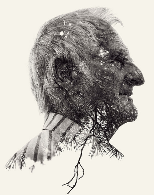


Can anyone tell me what the official "style" of this kind of photo manipulation is?? I forgot...
View media item 729151
It's a layering effect. I am sure you can just photoshop it but you can also achieve it with a DLSR that has that feature. Usually you shoot the portrait in direct light and then shoot some sort of landscape in normal light.
These are examples of it:


The Karl Kani logo I designed ended up on a piece of clothing Rihanna wore, small but I was pretty excited about it. She is by far the most famous person to wear something with something I designed on it. If any other web/graphic designers want to connect, my Instagram is @star3dgfx
View media item 743137
thats awesome
congrats ...