2017 NIKE NFL Apparel, Footwear & Jerseys

Falcons let me down. This is what we needed to do
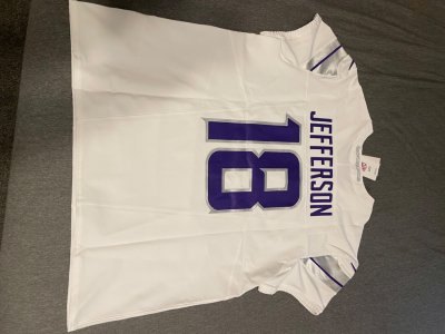
FDD9FACB-44C1-4E77-BEA8-D4569AC849C9.png

Grey pants would’ve really set the new uni’s off. Instead, they’re just XFL looking rejects.


0247EAC0-2F89-46A1-B9B3-CFC5B99FACB8.jpeg


FEFEF994-D3BA-4E67-AB2A-24CE0DC6F2CE.jpeg
 
Yeah those Falcons uniforms are terrible. Panthers had a pretty good troll tweet comparing them to the Mean Machine uniforms from Any Given Sunday.

I liked this tweet from the Raiders.

C4CBBDAB-92F3-4BB7-B584-2C7FA0FEFF92.png
 
man alot of these new NFL jerseys are trash man.

why did the Bucs go back that jersey? the one they had last year was dope IMO.

why did the falcons change? I liked there color rush jersey from last year as well. smh
 
The bucs jerseys lithe last few years have been eye soars and panned quite a bit. This look is much better. Falcons was dated. Not too sure how I feel about these, but better than the prior.

I like the Colts going back to old school numbers. Browns are supposed to debut new/more “classic look” unis tomorrow. The chargers, Rams, and Patriots are supposed to debut new looks within the next week as well.

Yeah, I think alot of teams jersey's in the past 20 years have tried to evoke the feeling of "forward thinking" when it comes to their uni's but it seems as if styles are switching back to the days simpler uni's where less is more. Most folks will probably say boring and plain though.
 
Why is it so hard to get Chiefs gear still? I thought winning a super bowl would force Nike into finally making fresh **** for my squad, but there isn't much out there.
 
Yeah, I think alot of teams jersey's in the past 20 years have tried to evoke the feeling of "forward thinking" when it comes to their uni's but it seems as if styles are switching back to the days simpler uni's where less is more. Most folks will probably say boring and plain though.

And on that note. “New” Browns Uni’s

2B943686-0C81-48F1-8148-9225C87664FE.jpeg

Should’ve just dropped these helmets for real though:lol:

582D3859-6272-496F-91DB-6D3D193F6C23.png
 
Browns jerseys are nice. The previous ones were nice too. They just had to fix the stripes. These new jerseys would look dumb to if they had the stripes going halfway into the chest.
 
That contrast stitching, the stripes, and team name on the previous Browns jerseys was all bad. This is an addition by subtraction.
 
previous jerseys were terrible

these are better but still nothing special

if only the browns could win..
 
I can't find of my team's Elites anymore. They really haven't sold any the past few seasons. They only had a custom away jersey in a size 56 for the past two seasons and that's not even there anymore.
 
Nah, both teams needed to change. Their jerseys were garbage.

nah we can agree to dis agree. That color rush bucs jersey was dope. that all red with that pewter colorway was fire.

also the falcons color rush jersey was fire. I thought the Falcons home and away jersey was regular. nothing spectacular.

both new falcons and bucs jersey are plain and trash
 
This was all they had to do to the jerseys, these are dope as ****. The stripes make and break that

3DAFF86B-EE5C-4169-BA12-D11DBD7CA18B.jpeg


Atlanta should have went with these instead

00349DF6-F1B4-4FE2-BD3C-1A04E7BBC9F4.jpeg
 
Agreed about the falcons jerseys. Strongly disagree with the browns jerseys. The ones the have now or went back to, are immensely better. Will grab an OBJ if he doesn’t get traded first lol.
 
thinking that's not legit. number panels on the front and back look way off, mesh holes seem to be bigger on that jersey and the inside tag looks weird, specifically the NFL shield doesn't have a very defined shape, and whenever you can see the football in the shield looking more like a hotdog bun than an actual football, that's usually a telltale sign

here's a pic of the inside tag of one of my authentics
IMG_4862.jpg
 
Damn, so close. Thanks. It’s so tough finding comparison photos of these white ones from the SB year but that tag is pretty telling. Thanks.

Also, the blue sides should have orange piping. Looks like I’ll just wait for M&N to drop that SB jersey:smh:
 
Last edited:
Can I please get a legit check? This one one of my grails, so fingers crossed.
9BC6474F-C16A-4323-8BDB-6BB0A4123AA5.jpeg


2E9F8A0E-91CA-4186-8A89-4686E073CF28.jpeg


0796B97C-2C0B-4DA7-A3E5-AB94AAF72C06.jpeg
100% fake. The jock tag looks higher than it should. Sticking on NFL shield is off based on the limited photo. Manning nameplate is squnched too close. And the retail tag suppose to be on the left I believe.
 
Chargers new jerseys are nice

# on the helmet is ok but I have a feeling people are gonna complain 1-2 games in and they're get rid of it
 
Back
Top Bottom