Mister Meaner
formerly super producer j
- Mar 24, 2007
- 21,229
- 11,759
Word [emoji]128070[/emoji]
Follow along with the video below to see how to install our site as a web app on your home screen.
Note: This feature may not be available in some browsers.
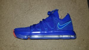
How about an actual golden state warriors cw ? or is that too goofy ?Ive been wearing the white pair for couple days now...i like them..to alot of people prolly to plain but id rather have that then something way too goofy..great casual shoe if you ask me
They'd be free by halftime
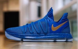
Yup, I checked my mailbox. Nothing!Couple of Bay Area sneaker heads got the anniversaries with special box and pins and autographed personalized card from KD, I'm jelly
Bayareagotsole and acervan316


How about an actual golden state warriors cw ? or is that too goofy ?
Did you get the same box ??Ive been wearing the white pair for couple days now...i like them..to alot of people prolly to plain but id rather have that then something way too goofy..great casual shoe if you ask me

For the first time the Under Armor logo looks good on a shoe (always hated their bland shoe designs but that's just personal preference). Jordan logo looks odd though.
There's nothing wrong with any of the logos, it's just ingrained in us that the Nike logo's better.That Anta symbol is awful. Is that supposed to be a bird?
I think the Under Amour looks ok, because the Peak and Anta look so bad.
Dunno if tall mess with "Joe" and Oneness, but looks like pretty much a FSR of Annis
good luck
https://www.oneness287.com/collections/all/products/nike-zoom-kd10-lmtd?variant=36152665673
There's nothing wrong with any of the logos, it's just ingrained in us that the Nike logo's better.
What exactly is the Nike logo look like?
It's not about being a grown man, you can be 9 or 99 and it wouldn't matter. Sorry my statement rubbed you the wrong way, I was speaking more about the programming and familiarity with the Nike logo which instantly makes it look better to most.Funny, I didn't know you and me were the same person, and I couldn't have an opinion.
You have yours, I have mine. I'm a grown man. And the logo is horrible.
I disagree wholeheartedly, the UA logo just looks way too plain and lame, Jordan symbol looks awesome, Nike swoosh just looks great. Even in a blind test I'm pretty sure the swoosh would win the majority of the time.It's not about being a grown man, you can be 9 or 99 and it wouldn't matter. Sorry my statement rubbed you the wrong way, I was speaking more about the programming and familiarity with the Nike logo which instantly makes it look better to most.
If that photo was shown to a person who had no knowledge of any of the companies none of the logos would be viewed as "Horrible".

I respect your point of view. Realistically speak, what makes the Nike swoosh look "Great"? I really wish there was a way that a blind test could be performed.I disagree wholeheartedly, the UA logo just looks way too plain and lame, Jordan symbol looks awesome, Nike swoosh just looks great. Even in a blind test I'm pretty sure the swoosh would win the majority of the time.