Post Your New Eras*59-Fiftys*etc... VOL. INFINITY NOW W/ Henz0/Thunderchunk/Icy's FAQ ON PG.1

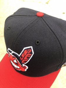
Is there a difference with the patches being on the left or right? Or it’s just how they making them?

Now that many of the caps have the new era logo on the right, patches will oftentimes be on the left. Previously though, patches, such as World Series patches, went on the right.
 
usually if the cap isn't the same color as their on-field counterpart that year the patch was used it will always be on the left, all "custom" colored caps will feature the NE flag on the right side.
i have seen some correctly colored fitteds with the patch on the left (with sometimes tonal or white flag) wouldn't be able to explain that though :lol:
 
Last edited:
Do different stores have a personal run of fitteds with their own colors? I’m seeing a lot fitteds I can find at one store but not another. Just curious how that works
 
A lot of the stores will have color combos as their own, unique to their own shop. They’ll determine the colorway, undervisor, patch etc.
Essentially their own store specific ‘custom’
 
ok, thanks for the replies. i was trying to get the atlanta hat with the all star patch. dude had one on the left side and one on the right. one had the new era logo and one didnt. im trying to get the most classic one
 
ok, thanks for the replies. i was trying to get the atlanta hat with the all star patch. dude had one on the left side and one on the right. one had the new era logo and one didnt. im trying to get the most classic one
0FB8C306-A2DA-4354-A4CA-93B1806B7AE9.jpeg
 
I bought a 2000 asg Braves a few months ago and it came on the right side. Months later, it shows up on the correct left side. I want to say there’s a method to the madness but I just don’t know.

I know they go through a design approval process, but even that seems to be changing. Side patches used to have to line up with the front logo design of that era. A 1981 ws patch had to align with the team logo from that era. But I’ve seen some leniency lately.
Some designers/creators/stores want the side flag visible. Some aim for the tonal look.
lil black jean jacket lil black jean jacket is right on track imho.
If it’s strictly a unique colorway and under visor , the patch has to go on the right (the wearers right side). If it’s an original design color way and 100% to spec (not just team colors), the patch can go on the left. But this may be more in line with what’s already in their database of approved designs. So it gets tricky

I think a lot changed in 2017 when they wanted the side flag to be prominent. New designs won’t allow them to cover up the flag (yet tonal is allowed lol). But old designs and even old hats lived by the standard of going with what’s accurate firstly.

I’ve tried to make sense of it. Some designs slip through the cracks where the correctly positioned patch shouldn’t have been allowed. Some places choose to have the side patch go on the wearers right even though it could go on the left.

I think the jist of it is this.
Quick example:
Two tone Indians with 100% to spec design can use the 1995 or 1997 ws patch on the wearers correct left side. But change one element to the design and it gets forced to the right. One example is a red crown or blue crown. Now take a wahoo hat and add a camo brim, and you’ll be forced to have a tonal flag on the wearers left. Some designers do choose to have the side flag a contrasting color too

The oddities are the standard WS patches going on 100% to spec hats and showing up on either side. That’s unexplainable to me. HH has a 97 Braves ws. And it has a side flag and the patch is on the wearers right. Doesn’t make sense.
 
Interesting to think that some people do prefer the logo patch. I wonder if it's a younger group that are getting used to what feels like the very, very recent visible logo patch on the on fields.

I've been very resistant to getting an on field with the logo patch. I actually hate the visible Nike logo on the jersey chest too. I'm probably gonna stick with Majestics and M&N jerseys for a while.
 
does anybody know which companies will take custom order MLB fitteds? looking to customized a TATC giants fitted if nobody is going to release them.
 
Yo respect to wallyhopp wallyhopp knowledge on new era fitteds. My man holding seminars:nthat::nthat:
Thanks. It’s mostly useless knowledge I’ve accumulated over the years.
Other than the Mariners (or anyone designing their hats) not being allowed to use the old supersonic colors, 99% of all color combos are all free game. It’s a crazy thing.

Where they’re beyond strict is with logos that need to coexist in the same timeline historically. Large wahoo debuted in 1986. He simply did not exist when the 1981 asg happened. That’s why HC used the block C for their 1981 asg side patch release last year.
Long story short, that’s been happening for many years now. But many caps have slipped through the cracks with a blend of eras. The recent 1954 asg patch on wahoo is historically wrong and should’ve been flagged. But that’s where the randomness and leniency comes into play. It’s also where the right and left side patches for hats coexist together. They have some historically inaccurate logos and such, so the randomness angle shouldn’t be overlooked either.
 
thanks for your replies wallyhopp, one more thing since we're on subject. i notice the patches and new era flags are swapped, but i also just noticed some hats dont even have the mlb logo in the rear lol
 
Yeah that’s another discrepancy that exists in the new era world. There are caps/designs that NE calls cooperstown collection hats. The batterman first appeared on hats in 1992, so many retro designs try to emulate the era by having no batterman on the back of say a 1975 ws patch yankees hat, or a 1990 asg hat.

but then say a retro script hat (currently on HC), those have the thicker raised batterman. And then a random 50th anniversary yankee stadium hat has a 1992-2006 era flat batterman, so it becomes a random mess once again.
Ecap has a 1980 Mets ws without the batterman, and at the same time a 1989 As with it. Their 88 Dodgers and 90 reds also has the batterman. All wrong.

I’ve noticed many of the true colors customs have battermans, so it may be a requirement. Sportsworld165 has a 1955 Dodgers with a batterman and a 1968 tigers with one too.

For years and many retro releases, the 1954-57 Indians logo had no batterman. This recent release features it
Try not to make sense of any of this.
A true to form 100% accurate pre 1993 cap should have no side flag, no batterman, and a green or grey under. Those elements today are hard to come by. They like the force things on designers now (mostly a side flag).

edit: just as I say all of this, I find this hat
The block C was around 1978-1985 with an outline, and in this traditional form since 2011. So a 1997 ws patch would/should not be on this cap at all. I think ne is overwhelmed and accepting everything. My whole explanation may be pointless lol.
 
Last edited:
You also have to take into account that teams can and do wear retro uniforms with matching on field New Era caps, so the caps match the current style with a batterman, for example, while utilizing the older logos, colors, designs.
 
Just picked this up locally. Iono if my eyes ****ing with me but is it a dark navy or black? Lol
6C00866B-65C2-4722-8733-6C06DB1E8EB2.jpeg
 

Attachments

  • 959908CC-DE9A-4569-9C2F-4AB8FA6FE34D.jpeg
    959908CC-DE9A-4569-9C2F-4AB8FA6FE34D.jpeg
    414.8 KB · Views: 85
Back
Top Bottom