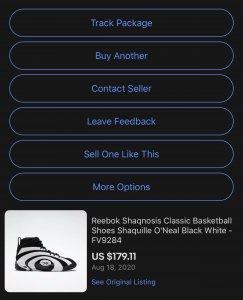
- 14,547
- 19,218
- Joined
- Jul 1, 2008
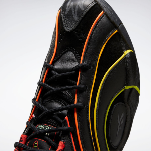
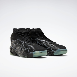
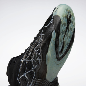
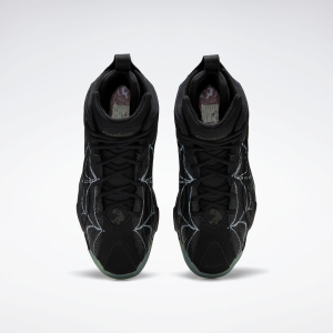
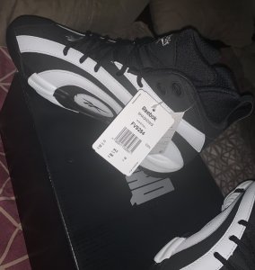
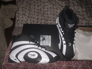
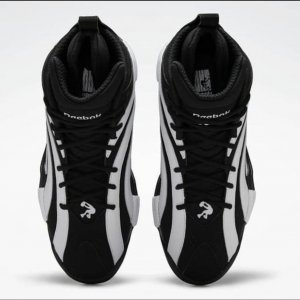
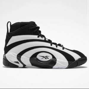
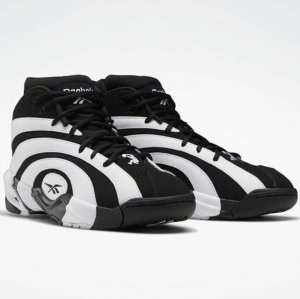
Anyone else's midsole looking off white after a few wears?
Follow along with the video below to see how to install our site as a web app on your home screen.

Note: this_feature_currently_requires_accessing_site_using_safari
Anyone else's midsole looking off white after a few wears?


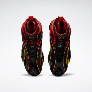
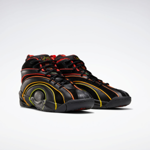
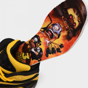
That monstrosity ended up being made and ready for a release SMH...

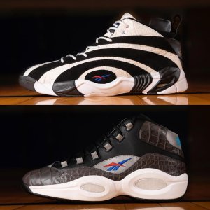
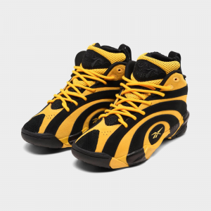
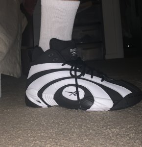
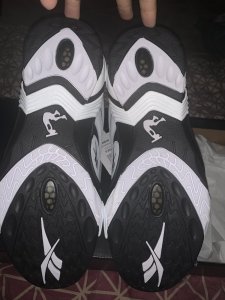
These are not that bad in my opinion. I could definitely make these work. The nickname thrown out there so far is "Miami Heat Marble".
That monstrosity ended up being made and ready for a release SMH...
I agree. All they had to do is use 2 colors per sneaker in order for it to work.