adidas won't renew NBA sponsorship

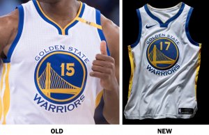
the clipper joints were fire until ballmer bought the team and rebranded everything... the new logo is trash
 
DGvmrjoVwAIPAxb.jpg

DGvmrjsVwAAdEmQ.jpg

DGvohasUQAAAAEH.jpg

DGvnJxEU0AAkgDG.jpg


http://www.nba.com/nuggets/news/new-era-fresh-new-look
 
Interesting cut around the back of the shoulders, hadn't noticed that before.

It's an improvement over the sports bra look that Nike had CBB teams wearing last year.
 
minny uniform mad nice....especially the shorts. idc its clean

will the miami heat make any changes?


why do i like the pistons uniform so much?
 
i was about to say that the only thing i didnt like about the wolves new uni is that they did not add those mountain features that the previous unis had but i noticed that the A seems to be the representation of the mountain stuff now
 
i was about to say that the only thing i didnt like about the wolves new uni is that they did not add those mountain features that the previous unis had but i noticed that the A seems to be the representation of the mountain stuff now
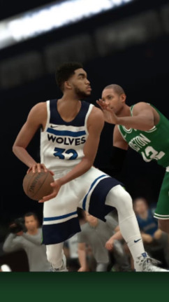
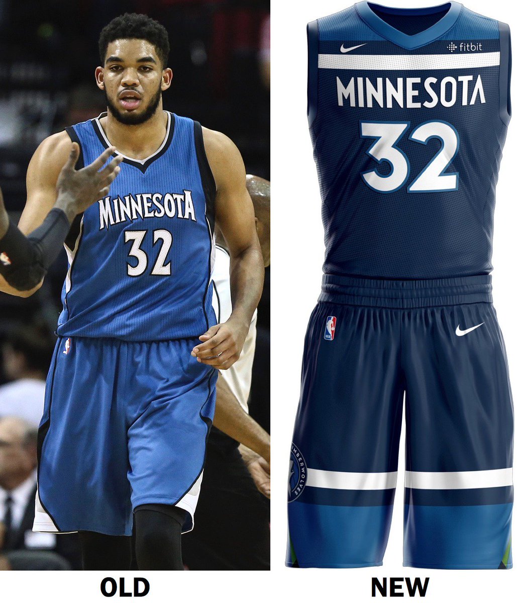
Thing is, I think it's just the font. State of Minnesota actually does not have ANY mountains if you can believe that. TWolves used the tree motif previously.

I do kinda dig the Wolves unis - half of it though is because as a Wolves fan (and dealing with their failings for 20 years) I was expecting something out of a 3rd grade art project. These remind me of the Bullets unis and I am presently surprised. Players are going to dig these I bet.
 
Funny thing is that I had a dream that I met Josh Jackson and devin Booker and I asked Josh if his number was really 99 and he said nah.

Guess dreams do come true.
 
I like the Harley Davidson logo/sponsor but the font looks weird, the "Bucks" are way to spaced apart while "Milwaukee" is just too squished together.
 
Aside from their Seahawks-esque alternate I'm digging the Wolves new unis.

The Suns' unis are clean too. :pimp: 
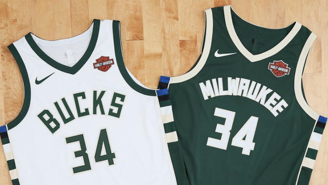
Hope they still have an orange and black unis in their set.
 
Back
Top Bottom