- 1,319
- 1,660
- Joined
- Jan 25, 2016
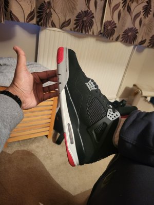
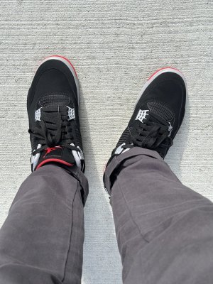
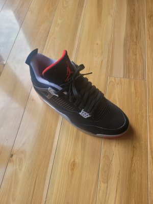
I didnt fray anything, never touched them, and its not just the front, its happening all over. Again its not 100% all the way around, but you can see that in about 2-3 weeks its going to be all over the shoeThe edges are fraying on the parts that are experiencing wear, like the toe. It will not do that at the same rate, or at all, on other parts of the shoe.
So while painting all the edges white don't make them look like the OGs or 99s, neither does fraying around the toe area to expose a darker grey line.
JB should have just done these properly.

 . Not anymore