- 1,023
- 2,392
- Joined
- Nov 15, 2019
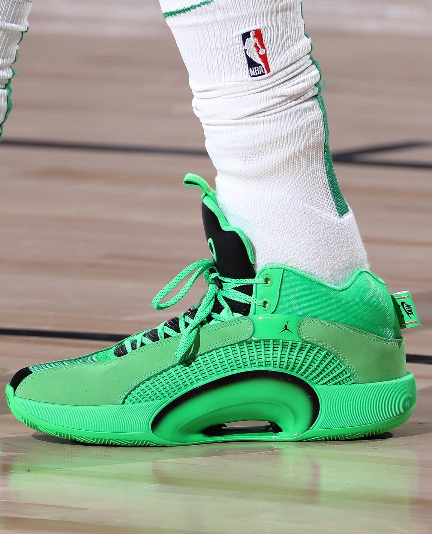
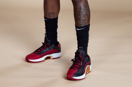
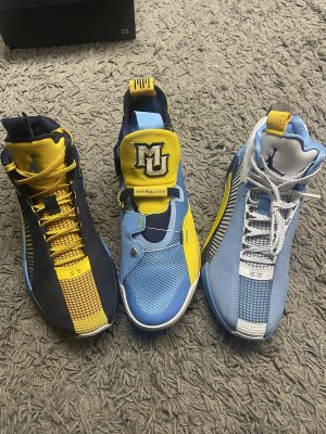
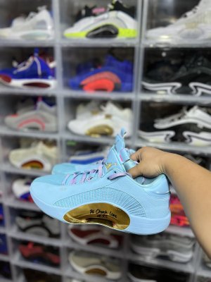
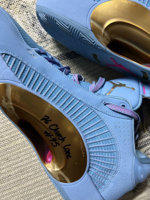
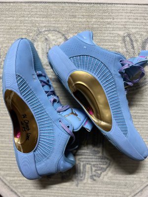
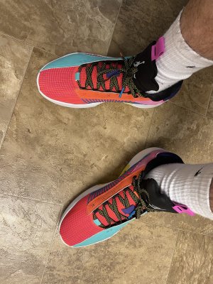
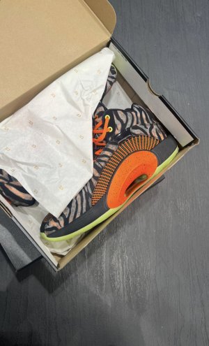
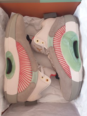
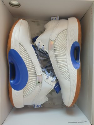
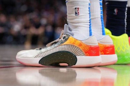
these didnt look good to me at all when looking at images online...but they looked way better in the celtics game tonight
maybe the colorways online have too much goin on...
maybe the colorways online have too much goin on...